Documentation
Almond
Thank you so much for choosing Almond.
Almond is a multi-purpose, multi-layout Moodle template featuring custom made Application and Page layouts, UI elements. In this documentation, you will find starter guides of the custom made Almond.
- Version: Moodle v4.+ & v5.+
- Author: Themes Almond
- Created: 2022-05-02
- Update: May 2026 / NOW FULLY COMPATIBLE WITH MOODLE Moodle v4.+ & v5.+
If you have any questions that are beyond the scope of this help file, Please feel free to email via Item Support Page.
Prerequisites
Before starting the installation
Default Language
Almond is loaded with default settings when installing. In this way, you will see a full
page on the frontpage, not a blank page.
During installation, "English" as the default language must be selected. So that the default
settings can be fully loaded.
- Navigate to → Site administration > Language > Language settings > Default language > English
Prepare a Folder
- Prepare a folder where you can unzip the downloaded .zip file. Unzip the downloaded package and open the /Almond-Theme-Package folder to find all the template files.
Almond-Theme-Package- Contains all of the file.V4.0+- Contains all of the theme for 4.0+ .Almond.zip- Contains all of the theme. This is the file that needs to be loaded in the setup.
V4.1+- Contains all of the theme for 4.1+ .Almond.zip- Contains all of the theme. This is the file that needs to be loaded in the setup.
V4.2+- Contains all of the theme for 4.2+ .Almond.zip- Contains all of the theme. This is the file that needs to be loaded in the setup.
V4.3+- Contains all of the theme for 4.3+ .Almond.zip- Contains all of the theme. This is the file that needs to be loaded in the setup.
V4.4+- Contains all of the theme for 4.4+ .Almond.zip- Contains all of the theme. This is the file that needs to be loaded in the setup.
V4.5+- Contains all of the theme for 4.5+ .Almond.zip- Contains all of the theme. This is the file that needs to be loaded in the setup.
V5.0+- Contains all of the theme for 5.0+ .Almond.zip- Contains all of the theme. This is the file that needs to be loaded in the setup.
Almondpage.zip- Contains the plugin file that needs to be installed.info_pages_examples.zip- Contains samples for the Full Page plugin.Almond-html--- Simple** Almond info page plugin ( simple ) html and css files.--- About.html and About.css--- Blog.html and Blog.css--- Blog-detail.html and Blog-detail.css--- Event.html and Event.css--- faq.html and faq.css--- gallery.html and gallery.css
Almond-Theme-Package- Contains all of the file (Moodle version 5.1.+).V5.1+- Contains all of the theme for 5.1+ .Almond.zip- Contains all of the theme. This is the file that needs to be loaded in the setup.
Almondpage.zip- Contains the plugin file that needs to be installed.info_pages_examples.zip- Contains samples for the Full Page plugin.Almond-html--- Simple** Almond info page plugin ( simple ) html and css files.--- About.html and About.css--- Blog.html and Blog.css--- Blog-detail.html and Blog-detail.css--- Event.html and Event.css--- faq.html and faq.css--- gallery.html and gallery.css
Almond-Theme-Package- Contains all of the file (Moodle version 5.2.+).V5.2+- Contains all of the theme for 5.2+ .Almond.zip- Contains all of the theme. This is the file that needs to be loaded in the setup.
Almondpage.zip- Contains the plugin file that needs to be installed.info_pages_examples.zip- Contains samples for the Full Page plugin.Almond-html--- Simple** Almond info page plugin ( simple ) html and css files.--- About.html and About.css--- Blog.html and Blog.css--- Blog-detail.html and Blog-detail.css--- Event.html and Event.css--- faq.html and faq.css--- gallery.html and gallery.css
Theme installation
Follow the steps:
- Unzip the Almond-Theme-Package.zip archive.
- Open the Almond-Theme-Package folder. Go in to the folder of the version you are using. (V3.11+, V4.0+ or V4.1+ or V5.0+)
- Log in to your Moodle site as an admin.
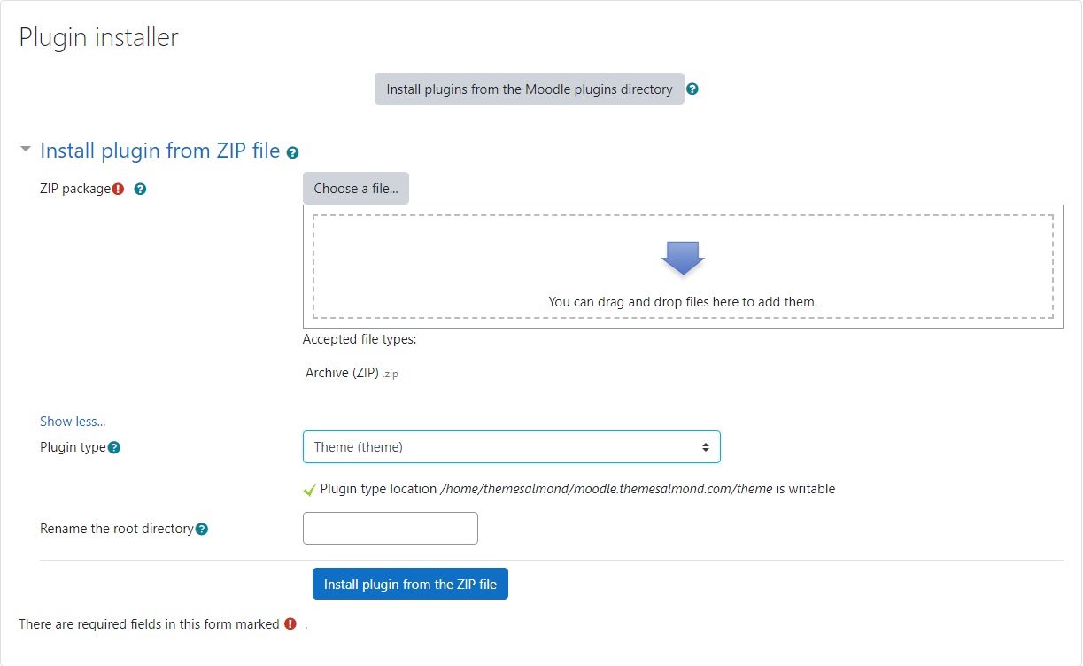
- Navigate to Site administration > Plugins > Install plugins
- Then upload theme ZIP file Almond.zip.
- You should now have the Almond theme. Navigate to → Site administration > Appearance > Themes > Theme selector.
- Select to Almond theme.
- You are good to go for adding your content now!
Plugin "Almond Page" installation
Follow the steps:
- Unzip the Almond-Theme-Package.zip archive.
- Log in to your Moodle site as an admin.
- Navigate to → Site administration > Plugins > Install plugins
- Then upload plugin ZIP file almondpage.zip.
- To use the plugin, all you have to do is use the "Almond Page". Navigate to → Site administration > Appearance > Themes > Almond > Info Pages

Theme Settings
As previously mentioned, Almond comes with variety of different layouts.
To customize these settings, navigate to Site administration > Appearance > Themes > Almond.
FrontPage Slider panel allows you to configure different slide styles for frontpage.

So, it is easier to prepare themes in line with your own needs with different combinations.
All block layouts can be found within the Demo app, you can try them over there and choose one that fits your needs.
Theme Activation
1. Follow the steps below to theme activation:
- Navigate to → Site administration > Appearance > Themes > Theme selector and click "Change theme" button at "Default" device type.
- Then find "Almond" theme and click "Use theme" button.
Pages
Almond has made the pages look their best for you. The theme contains many styles.
- Front page (46 Blocks + 6 Different Headers)
- Dashboard
- Calendar
- Course categories and single course pages
- Blogs
- Login
- HTML executable page specific to almond theme only
These styles are yours from the moment you buy the theme.
Remember, there is a lot of possibility of looks you can achieve with the Almond theme.

Getting started with the Frontpage section :
Moodle's structure might look overwhelming and intimidating at first, but following this page and giving a bit time to understand it before jumping right into desing will help immensely.We tried to make it quite simple with the almond theme. Almond is built without disturbing the moodle layout, so it will make your work easier.
We are excited to present you 100% dynamic frontPage ! Of course you are free to create your own codes, but you don't need any code to edit this page.
To customize these settings, navigate to → Site administration > Appearance > Themes > Almond.
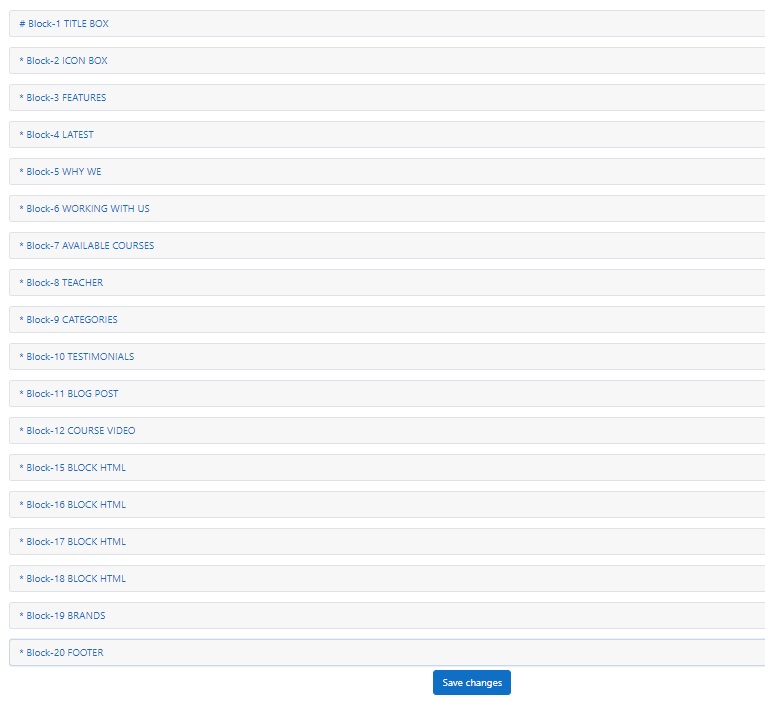
Blocks
We worked hard for the blocks and we are assertive about it. It is simple to use and can even be fun for you.
Each block is configurable independently. You are free to use whatever you want.
Blocks Settings
Disable the blocks you do not use for the system to run fast. You can find the disable button in the settings of each block.
1.Front Page One
This setting is used to determine the placement of the blocks on the front page. You can create the layout of your front page by choosing the 10 blocks that are most suitable for you among dozens of options.
Follow the steps below to set up your blocks:
- Navigate to Site administration > Appearance > Themes > Almond
- Go to the → Front Page > Front Page One
2.FrontPage Block
Detailed settings of the blocks you have selected are made in this section. You get a great look without writing any code.
Follow the steps below to set up your blocks:
- Navigate to → Site administration > Appearance > Themes > Almond
- Go to the → FrontPage Block > TITLE BOX/ ICON BOX/ FEATURES/ LATEST/ WHY WE/
WORKING WITH US/ AVAILABLE COURSES/ TEACHER/ BRANDS/ FOOTER

Almond Block Types
Some things you need to know about the TITLE BOX :
- Enable block : Make sure to tick this box to enable the block.
- Background color : Choose the color you want from our color palette. If you do not choose a color, it will automatically choose the main color of the theme.
- Caption : Add the text you want to add here.
- Button : Add a button for your title box.
- URL : Add a URL for your button.
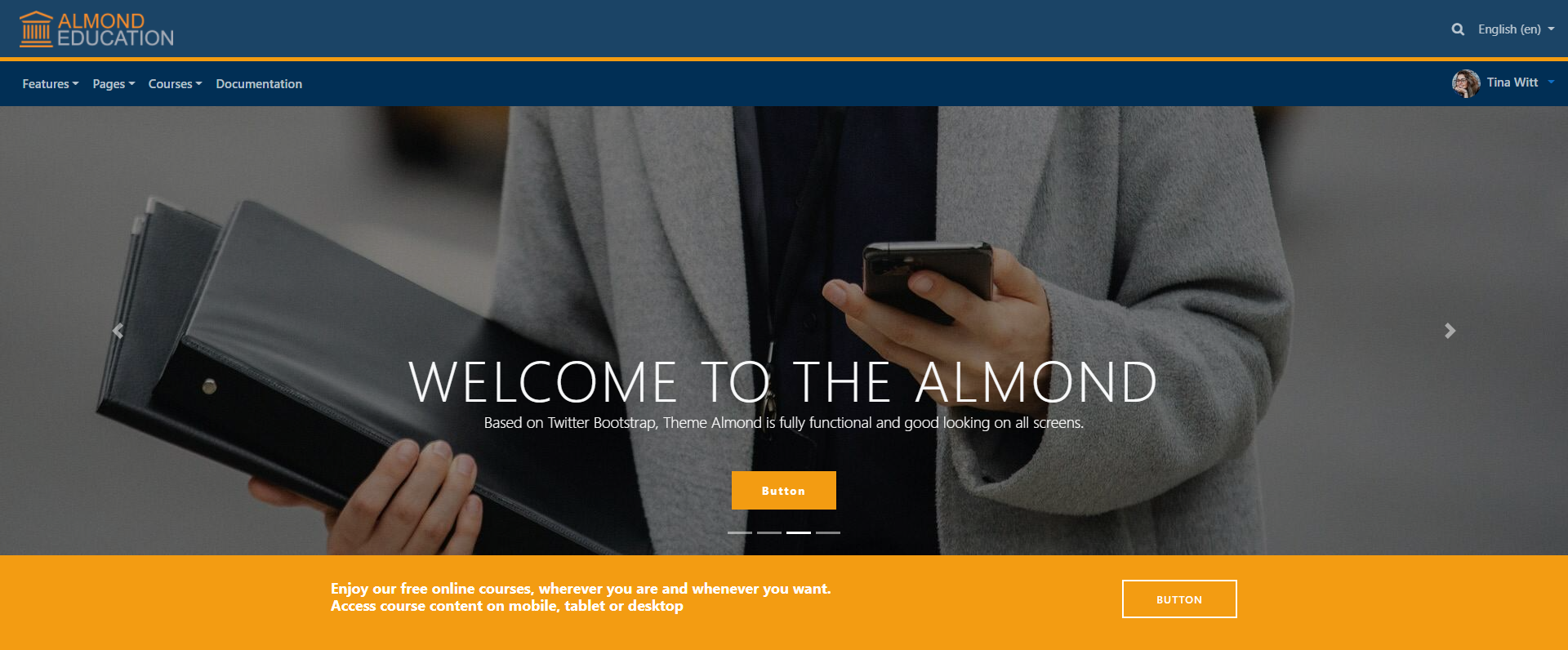
TITLE BOX Block View
Title : Block containing text and 1 link button. Click the picture.
Some things you need to know about the ICON BOX :
- Enable block : Make sure to tick this box to enable the block.
- Count : You can choose the number of cards here.
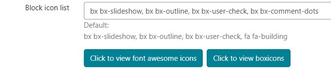
- Block icon : Here you can select the icons you want to appear.
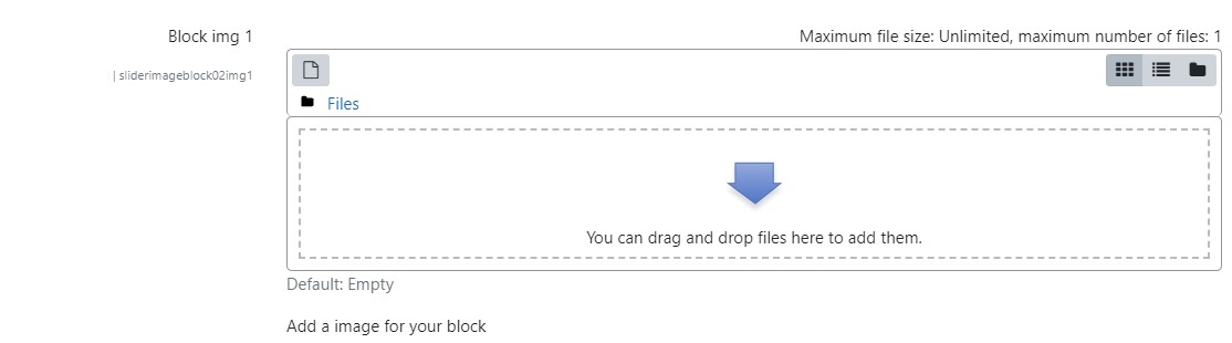
- Block img : Add a image for your block.
- Block title : Add a title for your block.
- Caption : Add a caption for your block.
- Button : Add a button for your block.
- URL : Add a URL for your block.
ICON BOX Block View
Iconbox 1: Block containing 2 cards that you can add the picture, text, icon you want and link to.Iconbox 2: Block containing 3 cards that you can add the picture, text, icon you want and link to.
Iconbox 3: Block containing 4 cards that you can add the picture, text, icon you want and link to.


Some things you need to know about the FEATURES :
- Enable block : Make sure to tick this box to enable the block.
- Design : You can add the number of the "features" style you want by selecting it.
- Header : Add a title for your block.
- Block icon : Here you can select the icons you want to appear.
- Block title :You can write the title that will appear on the card here.
- Caption : Add a caption for your block.
- URL : Add a URL for your block.
FEATURES Block View


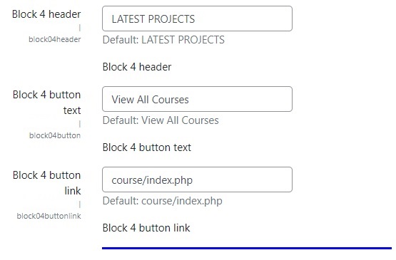
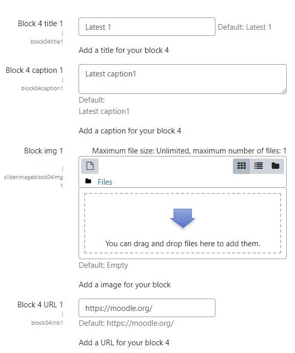
Some things you need to know about the LATEST :
- Enable block : Make sure to tick this box to enable the block.
- Design : You can add the number of the "latest" style you want by selecting it.
- Header : Add a title for your block.
- Button text :You can add your button text.
- Button link : You can redirect to other pages as in the demo.
- Block title : Add a title for your block.
- Caption : Add a caption for your block.
- Block img : Add a image for your block.
- URL : Add a URL for your block.
LATEST Block View


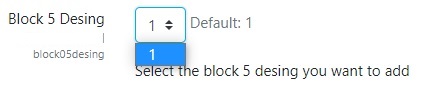
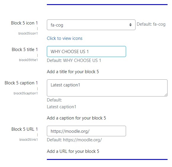
Some things you need to know about the WHY WE :
- Enable block : Make sure to tick this box to enable the block.
- Design : You can add the number of the "why we" style you want by selecting it.
- Block img : Add a image for your block.
- Header :Add a title for your block 5.
- Block icon :Here you can select the icons you want to appear.
- Title : Add a title for your caption.
- Caption : Add a caption for your block.
WHY WE Block View

Some things you need to know about the WORKING WITH US :
- Enable block : Make sure to tick this box to enable the block.
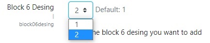
- Design : You can add the number of the "Working With Us" style you want by selecting it.
- Background color : Choose the color you want from our color palette. If you do not choose a color, it will automatically choose the main color of the theme.
- Block img : Add a image for your block.
- Block header :Add a title for your block 6.
- Caption : Add a caption for your block.
- Button : Add a button for your block.
- URL : Add a URL for your block.
WORKING WITH US Block View


Some things you need to know about the AVAILABLE COURSES :
- Enable block : Make sure to tick this box to enable the block.
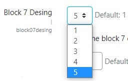
- Design : You can add the number of the "courses" style you want by selecting it.
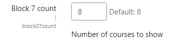
- Count : Type the number of courses you want to appear.
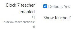
- Teacher Enabled :If you check it, it brings the name and picture of the teacher of the lesson.
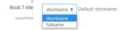
- Block title :You can set the course title as a long title or a short title.
- Block header :Add a title for your block 7.
- Button : You can set to show more courses.
- URL : Add a URL for your button.
AVAILABLE COURSES Block View


Some things you need to know about the TEACHER :
- Enable block : Make sure to tick this box to enable the block.
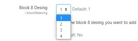
- Design : You can add the number of the "teacher" style you want by selecting it.
- Total : If you want to show the total number of courses and students for the role you selected, you can mark it.
- Description : Shows the description on the profile page of the role you selected. If you want to see it on the block card, you can mark it.
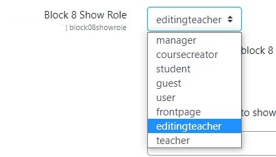
- Show Role : A role is a collection of permissions defined for the whole system that you can assign to specific users in specific contexts.
The combination of roles and context define a specific user's ability to do something on any page.
The most common examples are the roles of student and teacher in the context of a course.
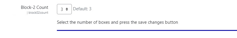
You can show users with any role, in this block. Even if you define a new role from the settings, it will be automatically added to the options below. - Count : You can set the number of people you want to add.
- Header : Add a title for your block 8.
- Caption : You can add block description.


TEACHER Block View


Some things you need to know about the CATEGORIES :
- Enable block : Make sure to tick this box to enable the block.
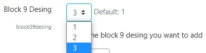
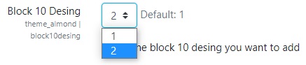
- Design : You can add the number of the "categories" style you want by selecting it.
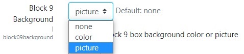
- Background : You can add color or image to the background of your category cards or choose none.
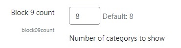
- Count : You can set the number of cards.
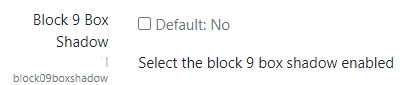
- Box Shadow :You can add shadows to your course cards.
- Header : Add a title for your block 9.
- Caption : You can add block description.
CATEGORIES Block View


Some things you need to know about the TESTIMONIALS :
- Enable block : Make sure to tick this box to enable the block.
- Design : You can add the number of the "testimonials" style you want by selecting it.
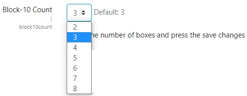
- Count : You can set the number of slide pages here.
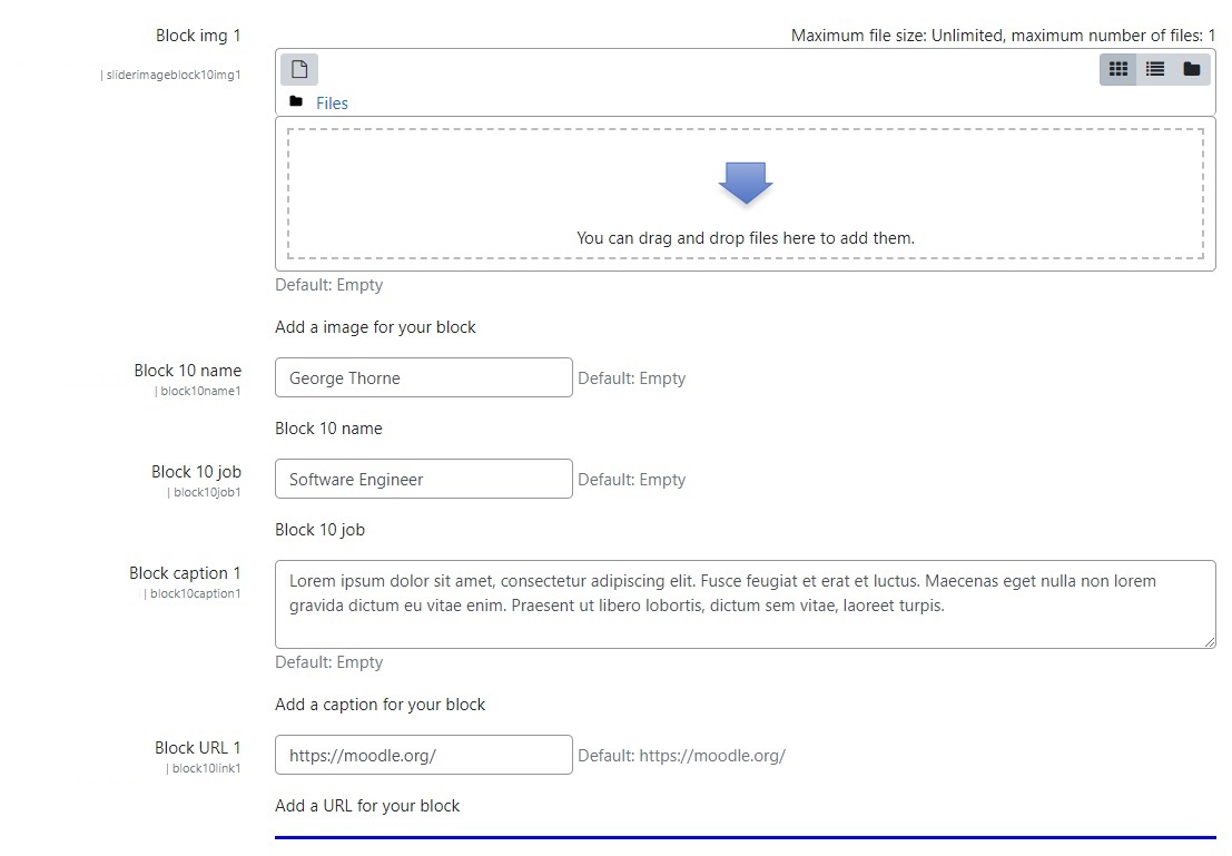
- Header : Add a title for your block 10.
- Block img : Add a image for your block.
- Name: You can write the person's name in this box.
- Job : You can write the person's profession in this box.
- Caption : You can write the person's comment in this box.
- URL : Add a URL for your block.
TESTIMONIALS Block View


Some things you need to know about the BRANDS :
- Enable block : Make sure to tick this box to enable the block.
- Design : You can add the number of the "brands" style you want by selecting it.
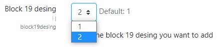
- Header enable : You can tick the box to make the block header visible.
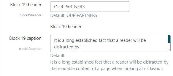
- Header: Add a title for your block 19.
- Caption : Add a caption for your block.
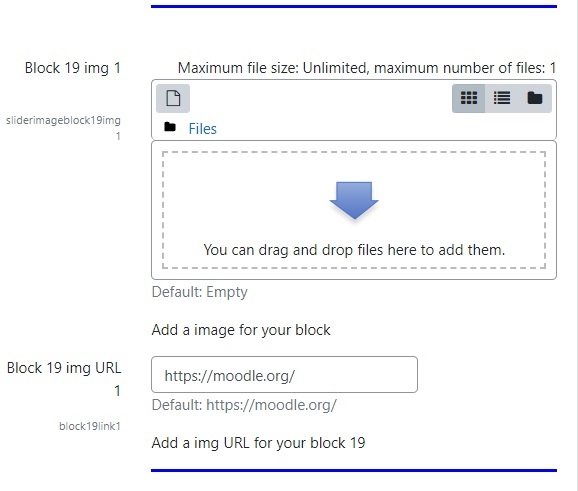
- Block img : Add a image for your block.
- Block img URL : Add a img URL for your block 19.

BRANDS Block View


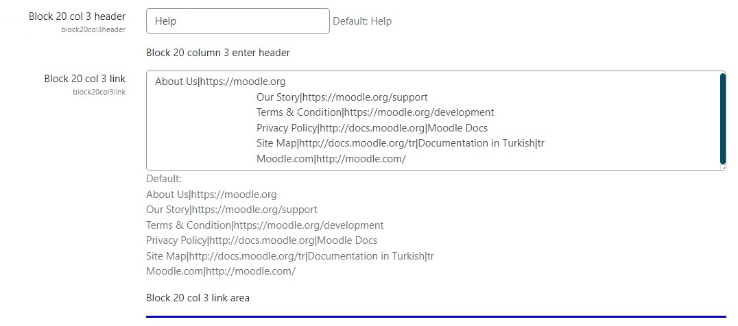
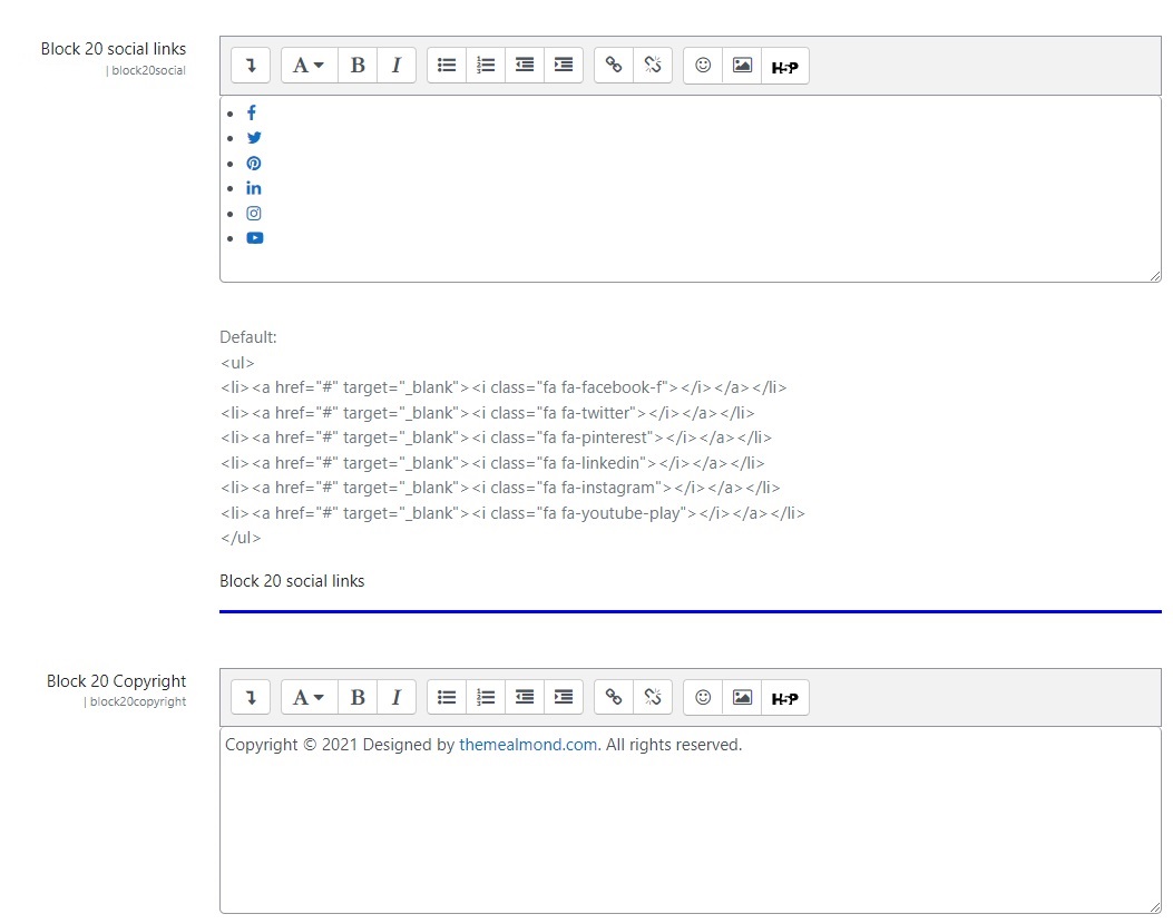
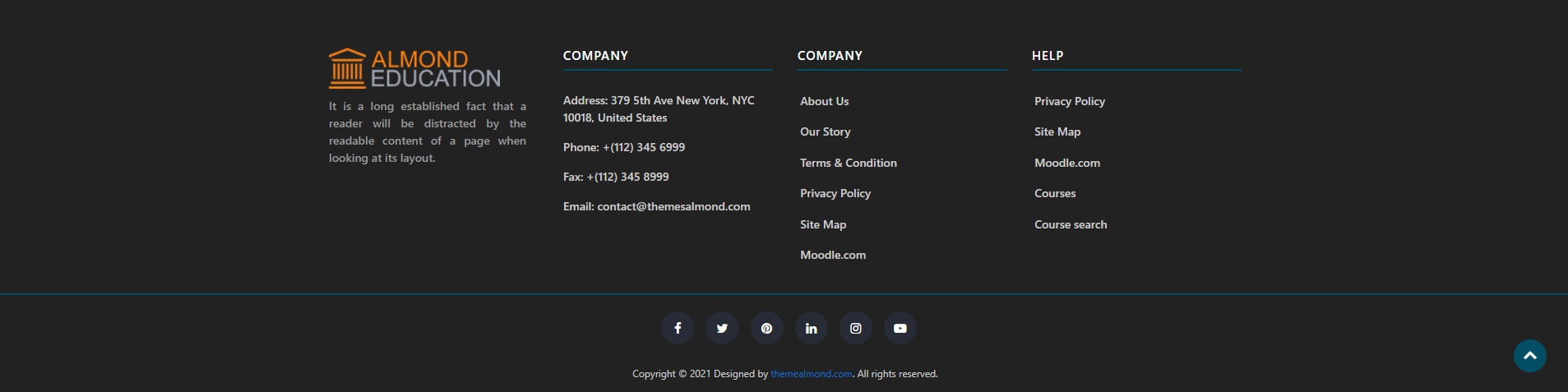
Some things you need to know about the FOOTER :
- Enable block : Make sure to tick this box to enable the block.
- Background color : Choose the color you want from our color palette. If you do not choose a color, it will automatically choose the main color of the theme.
- Logo : You can show your site logo here.
- Header : You can write your site name here.
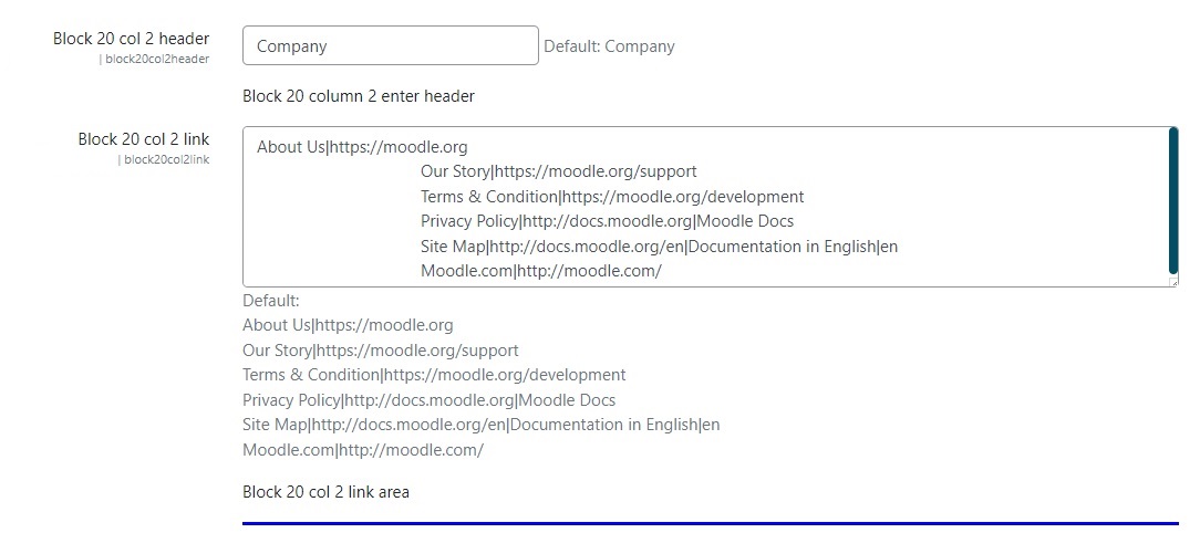
- Col 2 link : You can use this box for the links you want to create.
- Col 3 link : You can use this box for the links you want to create.
- Social links
- Copyright
FOOTER Block View
Header
Header is important for users. We have presented 3 different header designs + dark / light mode for your use. It is very easy to make personalized headers with the Almond theme.
To customize these settings, navigate to → Site administration > Appearance > Themes > Almond.
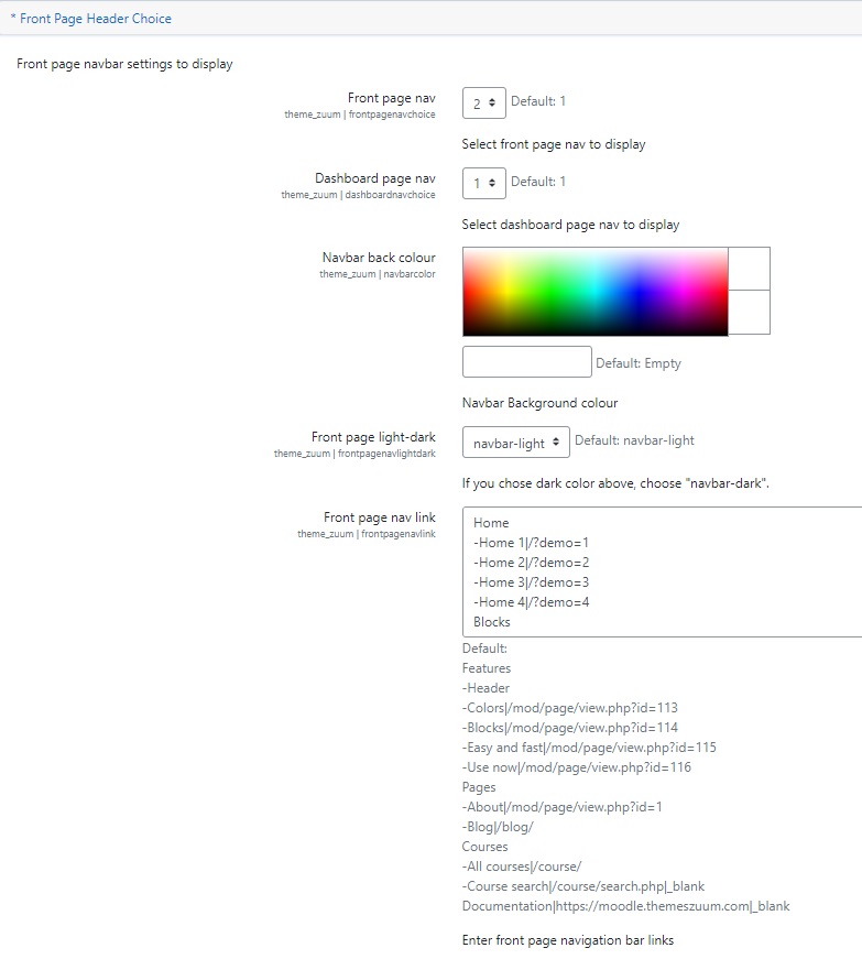
Some things you need to know about the header :
- Front page nav : Choose from different header views.
- Navbar back colour : Choose the color you want from our color palette.
- Front page light-dark : This part is important. Choose one of the dark or light options according to the color you set and get better visibility of your header links.
- Front page nav link : We have given our tips on how to create your links on the settings page. However, we would like to remind you of one thing. Adding "|_blank" after your link will create a link for you to open in a different tab.
How to link a navigation bar to a section on the same page ?
Each of the Almond frontpage blocks has its own unique id. The navbar links you create using these ids can go to different sections on the same page.
So how to do ?
Navigate to → Site administration > Appearance > Themes > Almond > Front Page > Front Page Header Choice > Front page nav link
For example you want to add the "Teacher" block to the navbar. The "Teacher" block in the Almond theme is the 8th block. The id of the blocks is determined as belows :
block[number]-[design number]
If we need to adapt it to the teacher block, we will do it like this :
Let's say we use the 1st design of the Teacher block on the frontpage page. We said that the teacher block is the 8th block. So the id for this block looks like this :
block8-1
We should write it as navbar link like this : -Teachers|#block-8-1
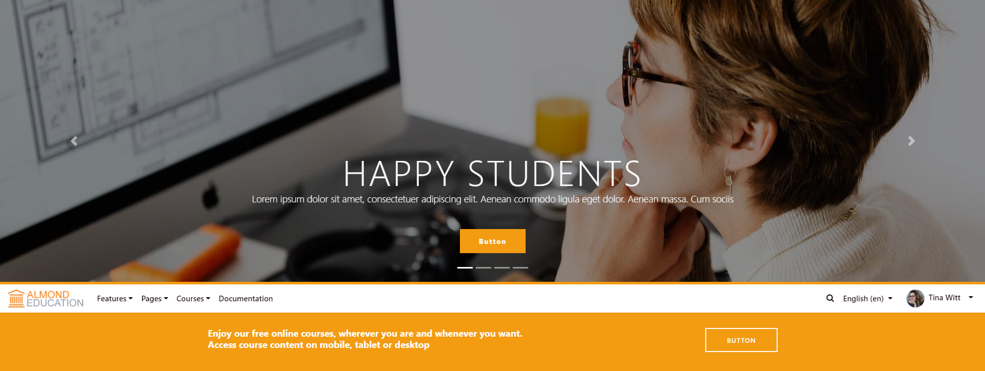
Header Types
- Header - Under Slide: Unusually, the header is located at the bottom of the slide.
- Header Dark - Under Slide: Unusually, the header is located at the bottom of the slide and is dark color.
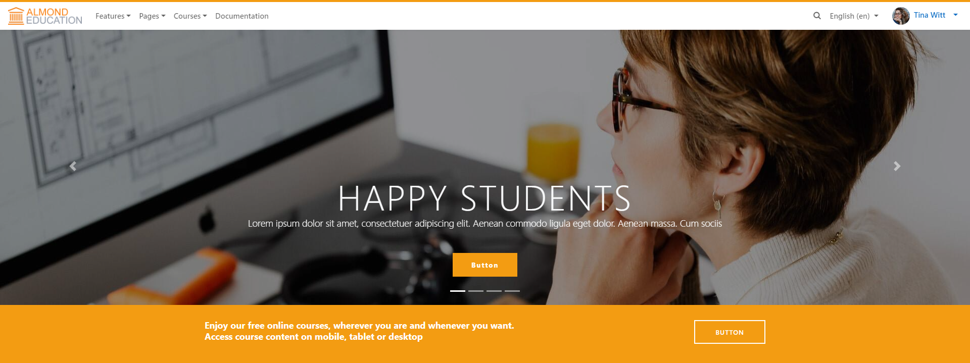
- Header - Thin: Elegant and slim design.
- Header Dark - Thin: Elegant, slim design and dark color.
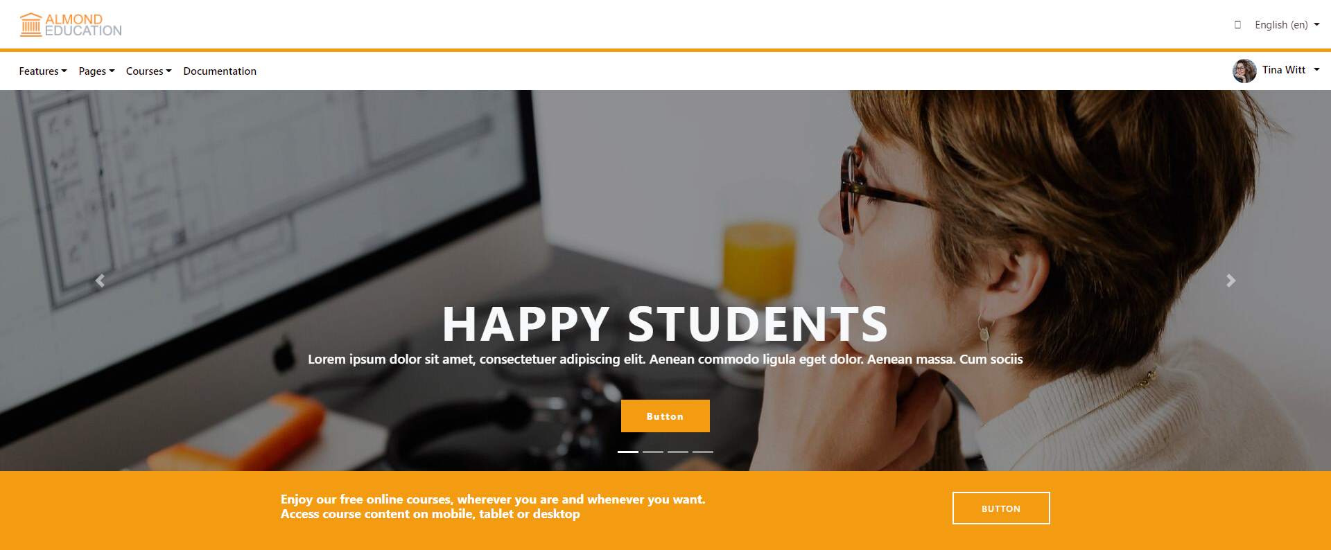
- Header - Double: A different header that highlights your logo.
- Header Dark - Double: A different header that highlights your logo and is dark color.
1.Header - Under Slide
2.Header Dark - Under Slide

3.Header - Thin
4.Header Dark - Thin
5.Header - Double
6.Header Dark - Double
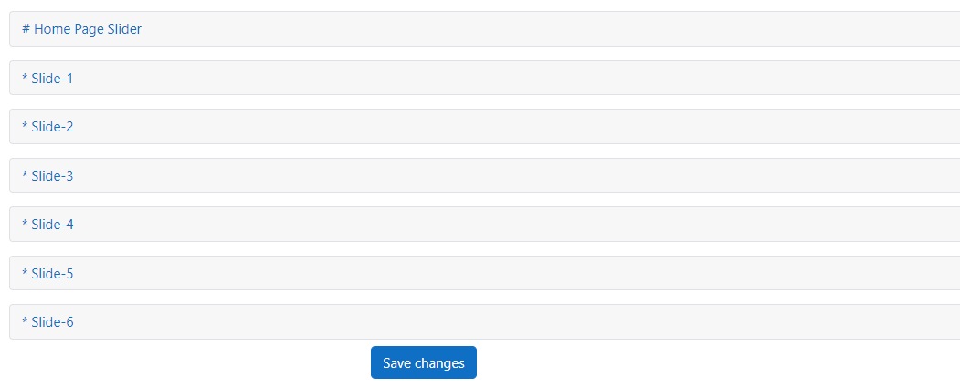
Slider
This section contains settings for the slider of the almond theme.
Follow the steps below to set up your slider:
- Navigate to → Site administration > Appearance > Themes > Almond
- Go to the → Home Page Slider >Home Page Slider/Slide-1/Slide-2/Slide-3/Slide-4
What can I do with Slider ?
"Slider Caption" part is sensitive to the HTML and Bootstrap codes you write.
So how to do ?
Navigate to → Site administration > Appearance > Themes > Almond > Front Page > Front Page Header Choice > Front page nav link
For example you want to add the "Teacher" block to the navbar. The "Teacher" block in the Almond theme is the 8th block. The id of the blocks is determined as belows :
block[number]-[design number]
If we need to adapt it to the teacher block, we will do it like this :
Let's say we use the 1st design of the Teacher block on the frontpage page. We said that the teacher block is the 8th block. So the id for this block looks like this :
block8-1
We should write it as navbar link like this : -Teachers|#block-8-1
Colors
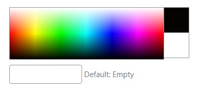
For us, being able to choose colors freely is the most important step in personalizing your theme. You can either use the color codes we have listed for you, create your own color from the color palette, or write your own color code.
Follow the steps below to set up your colors:
- Navigate to → Site administration > Appearance > Themes > Almond
- Go to the → Front Page > Front Page Choice
The color of your choice magically changes all the colors inside the almond theme.
Pictures
While preparing the Almond theme, our goal was to provide users with maximum convenience and speed. That's why we've thought of everything about uploading images.
Here are some tips about pictures:
- You are free to upload the pictures you want from the settings to some blocks, but you don't have to.
Open the theme folder and Navigate to → Pix folder and you can upload your own images instead of existing ones.It is important that you do not change the names of the images. Almond displays pictures by these names.
- Your other option is to go to settings and upload pictures.
For block-2, block-4, block-5, block-6,block-19, you can upload pictures by applying the above item if you want. But you can also upload images manually from each block's settings.
If no images are loaded from the settings section, the almond theme will fetch the images from the pix folder.
1.Course Pictures
You must upload an image when creating a new course. Course images automatically appear on your front page. You don't need to make any extra settings for this.

2.Category Pictures
Category images are based on the image of the first lesson belonging to that category and do not require an extra image upload step. If the image cannot be displayed, please make sure that the first course in the category has an image.

3.Teacher Pictures
Teacher pictures are also brought to the front page by almond.
When you select the user category you want to display in the teacher block settings, the images of the people belonging to that category are
automatically displayed on your front page.
We don't want you to miss that this block is multifunctional.
Note Please be sure to review. In this document Navigate to → Almond Structure > Blocks > Almond Block Types > Block-8 TEACHER Blocks

Updating
You can install all kinds of upgrades for free when you buy the Almond theme.
Moodle
Navigate to → Site administration > Plugins > Install Plugins and upload the file you downloaded here.
All saved settings are stored in the Moodle database. It ensures that no data will get deleted.
Make sure to back up the files before making any changes.
NotePlease go to official moodle documentation for a full information of updating: Moodle Documentation
Special Page Plugin
Creating different pages for your needs is very easy with Almond. It is enough to install the "Almondpage" plugin we have developed for you. This plugin comes with theme when you buy the theme. You don't pay any extra fees or download it from anywhere else.
Install the Plugin
There are 2 different simple ways to install the plugin. You don't have to worry. After installing, you can start using it directly.
Option 1:
- Navigate to → Site administration > Plugins > Install plugin
- Please upload the plugin file as a zip file.
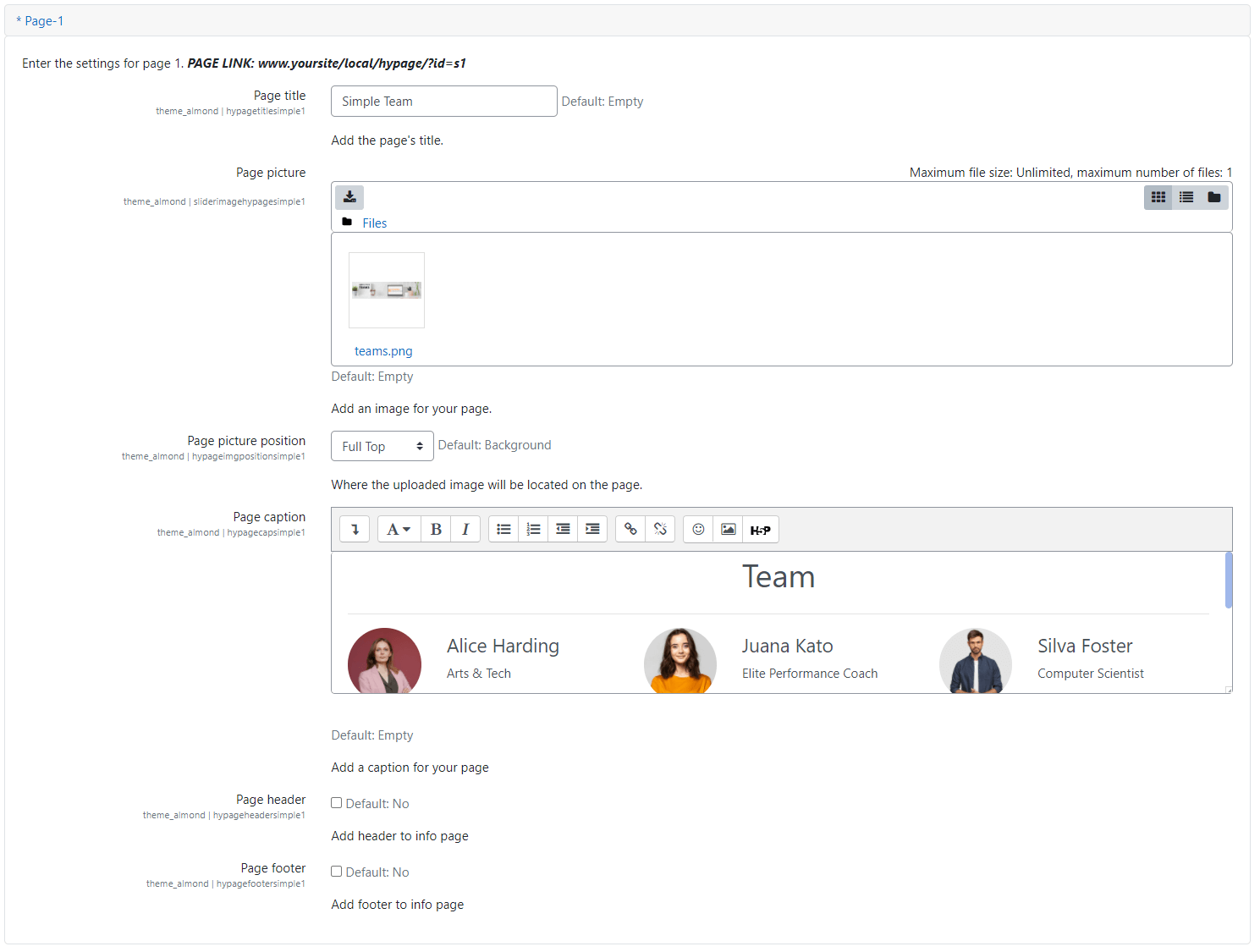
To use the plugin, all you have to do is use the "Info Pages" tab in the Almond settings. To do this, Navigate to → Site administration > Appearance > Themes > Almond > Info Pages
Option 2:
- Open the "Moodle" folder in the file directory.
- Go to the "Local" folder and paste the "Almondpage" plugin file here.
To use the plugin, all you have to do is use the "Info Pages" tab in the Almond settings. To do this, Navigate to Site administration > Appearance > Themes > Almond > Info Pages
How can I access the pages easily?
If you want, you can add the links of your page to the navbar section and you can reach it with a single click. Follow the steps below :
- Navigate to → Site administration > Appearance > Themes > Almond > Info Pages
- For each page setting you click on, you will see a link like this:
www.yoursite/local/almondpage/?id=a1
- You can add this link on the navbar for easy access to these pages. Navigate to → FrontPage Structure > Header > Front page nav link. You will find the necessary steps in that section.
Advanced Page Settings
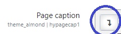
In the "Advanced Page" section, you can add a style file link or write your own style codes.
- Page caption: This part is for writing your html codes. Please follow the steps in order. Then you can write your html codes in this part.
- Page css link: If you want to get css code from a link, use this box.

Simple Page Settings
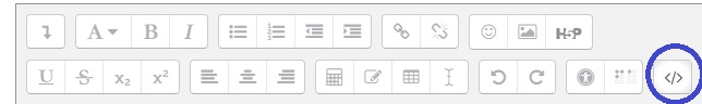
In the "Simple Page" section, you can create content using only the editor instead of the style file. Moodle uses bootstrap. You can create wonders with only html by using bootstrap classes.
- Page caption: This part is for writing your html codes. Please follow the steps in order. Then you can write your html codes in this part.
Ready-to-use Pages
We have prepared ready-use pages for you using the plugin. When you buy the theme, it comes with the html and style files of these pages You can use it by following the steps above.


Login Design
Almond comes with different settings for login. You can customize your settings by following the steps below :
- Navigate to → Site administration > Appearance > Almond > Theme Settings
- You can select an image for the background from the "Login background image" section.
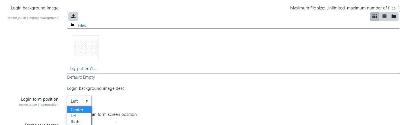
- "Login form position" section selects the position of your login box on the screen.


Languages
You don't have to worry about using Almond theme in different language. You can translate the theme to your desired language by following the steps below :
- Navigate to → Site administration > Language > Language customization
- Choose the language you wish to customize
- Once the language pack is loaded, click "Continue"
- Under "Filter strings", choose "theme_almond.php", and click "Show strings"
- You can save the strings after customizing them according to your language
On this page you can also search for particular strings.
Source & Credits
Images:
- Freepik - https://www.freepik.com/home
- Pexels - https://www.pexels.com/
Fonts:
- Icons Font Face - https://fontawesome.com/
Scripts:
- Bootstrap 4 - http://getbootstrap.com/
- Splide - https://splidejs.com/
Support
If this documentation doesn't answer your questions, So, Please send us Email via Item Support Page
We answer all questions within 12-24 hours in weekdays. In some rare cases the waiting time can be to 48 hours. (except holiday seasons which might take longer).
Changelog
See what's new added, changed, fixed, improved or updated in the latest versions.
For Future Updates Follow Us @themesalmond / @facebook / @Linkedin
Moodle v3.11 (2022-05-02)
Initial Release
Moodle v4.0 (2022-05-21)
Initial Release
Moodle v4.1 (2023-01-07)
Initial Release
Moodle v4.2 (2023-05-07)
Initial Release
Moodle v4.3 (2023-10-29)
Initial Release
Moodle v4.4 (2024-05-03)
Initial Release
Moodle v4.5 (2024-11-07)
Initial Release
Moodle v5.0 (2025-05-09)
Initial Release
Moodle v5.1 (2025-11-01)
Initial Release
Moodle v5.2 (2026-05-10)
Initial Release