Educard Document
| Site: | Almond Themes |
| Course: | Educard DOCUMENT |
| Book: | Educard Document |
| Printed by: | Gast |
| Date: | Tuesday, 16 September 2025, 10:11 AM |
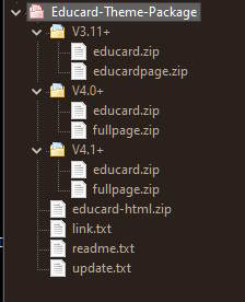
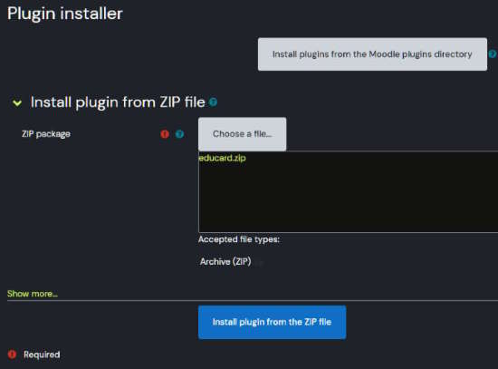
Contents of Educard-Theme-Package.zip :
educard.zip : Contains all of the theme. This is the file that needs to be loaded in the setup.educardpage.zip : Contains the info page plugin file that needs to be installed (for 3.11+).
fullpage.zip : Contains the fullpage plugin file that needs to be installed.
educard-html.zip : Sample HTML and CSS files for the Page plugin and HTML blocks.
links.txt : You can download the assets of the theme here.
readme.txt : Short note about the theme.
update.txt : Informations about theme update.
V3.11+, V4.0+, V4.1+ : Moodle versions.
Before starting the installation
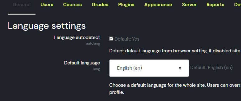
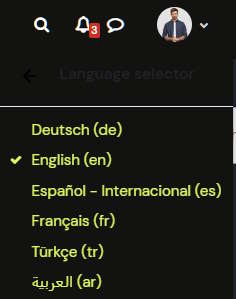
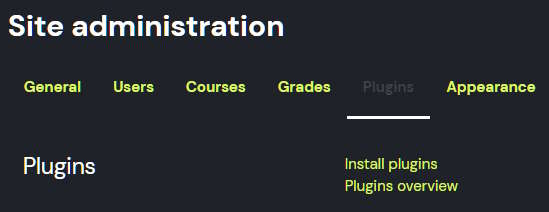
Educard is loaded with default settings when installing. In this way, you will see a full page, as you see in the demo, not a blank page on the front page. During installation, "English" must be selected as the language. If you don't know how to do it, you can change it by looking at picture 1 and picture 2. So the default settings can be loaded completely. Loading the default settings will create a visual example for you, so you can customize the theme settings faster. If you install it in a different language, you can continue by updating the empty theme settings.
When you do this, educard automatically takes the picture it needs from the relevant block folder according to the design number. If you want to change the block images, copy them over the existing images (like copy image.jpg to 1.jpg). Pay attention to the image extensions, if the extension is svg, replace svg with png if the extension is png, and if the extension is jpg, replace it with jpg. If you change it to a different extension, the image will not be displayed.
! WARNING :
If you upload a picture from the block settings to the block that needs a picture, if there are different designs in that block, the same picture will be displayed in all designs. If you do not want to change the picture again according to the design when you change the designs of the blocks, use the image folder. Upload different images for the designs of a block so that when the design changes, the images will change.
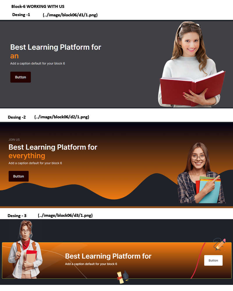
Image 1 (../image/block06/d1/1.png)
Image 2 (../image/block06/d2/1.png)
Image 3 (../image/block06/d3/1.png)
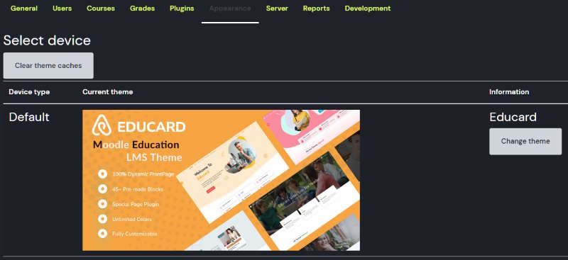
Pictures SiteAdministration/Appearance/
Educard/Block/Block-6 WORKING WITH US
Block image
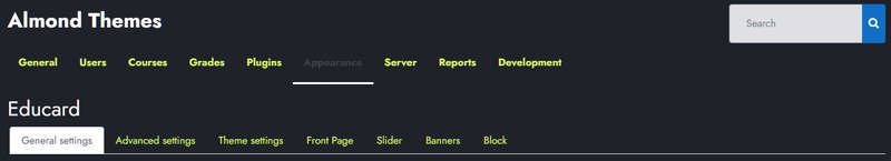
Educard Theme Theme settings
General settings : General settings are available.Advanced settings : scss, css settings.
Theme settings : Theme settings are available.
Front Page : Front Page settings are available.
Slider : Slider settings are available.
Banners : Banner settings are available.
Blocks : Blocks settings are available.
You can customize your theme from the tabs above. Read on for detailed explanations.
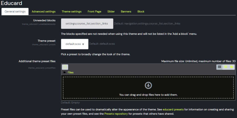
Educard Theme General settings tab desciription :
Unneeded blocks : Enter the blocks that you do not want to appear in the 'Add a block' menu here.Theme preset : Don't change this
Additional theme preset files : Leave this blank.
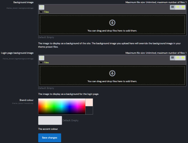
Background image : Here you can add a background image. !Warning Adding a background image can spoil the look of the theme.
Login page background image : The image to display as a background for the login page.
Brand colour : Leave it blank.
Save Changes Click for your changes to save.
For more, visit the Moodle docs.
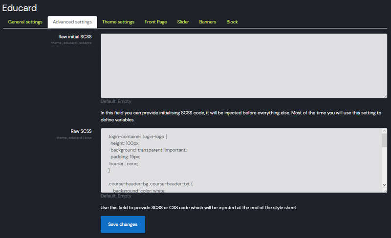
Educard Theme Advanced settings tab desciription :
Raw initial SCSS : If you do not have enough knowledge about moodle and scss, do not use this field.Raw SCSS : You can enter the css changes you need that are not in the theme here.
Save Changes Click for your changes to save.
! WARNING The changes you make here may spoil the theme appearance. If you do not have enough knowledge about SCSS and CSS, do not use these fields.
For more, visit the Moodle docs.
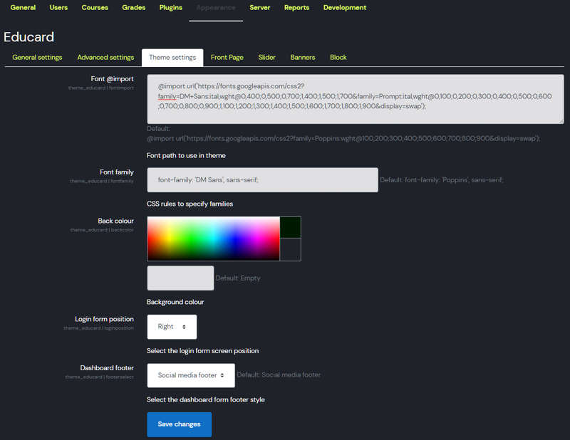
Educard Theme Theme settings tab desciription :
Font @import : You can change the site font style here. Google fonts Enter the font information you will get from Google fonts site or another site as shown in default and save. To see the new fonts, refresh your site with ctrl+f5, if you can't see the new fonts, make Purge caches and check again.Font family : Enter here the Font family of the font style as it appears in the default.
Back colour : You can change the background color of your site.
Login form position : Determine the screen position of the login form.
Dashboard footer : Select the footer style you want to appear on the dashboard.
Save Changes Click for your changes to save.
! WARNING The changes you make here may spoil the theme's appearance. If you are not an expert in these matters, do not change the default settings.
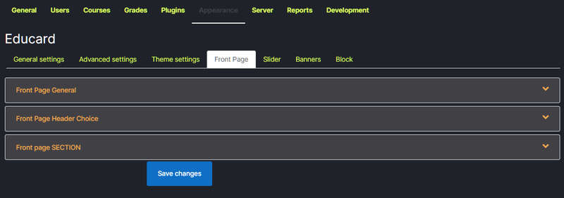
Educard Theme Front Page tab desciription :
Front Page General : General settings related to front page.Front Page Header Choice : Front Page Header selection and settings.
Front Page Section : Here you can choose which position the blocks will be displayed on the front page.
Proceed to the next section for a detailed explanation.
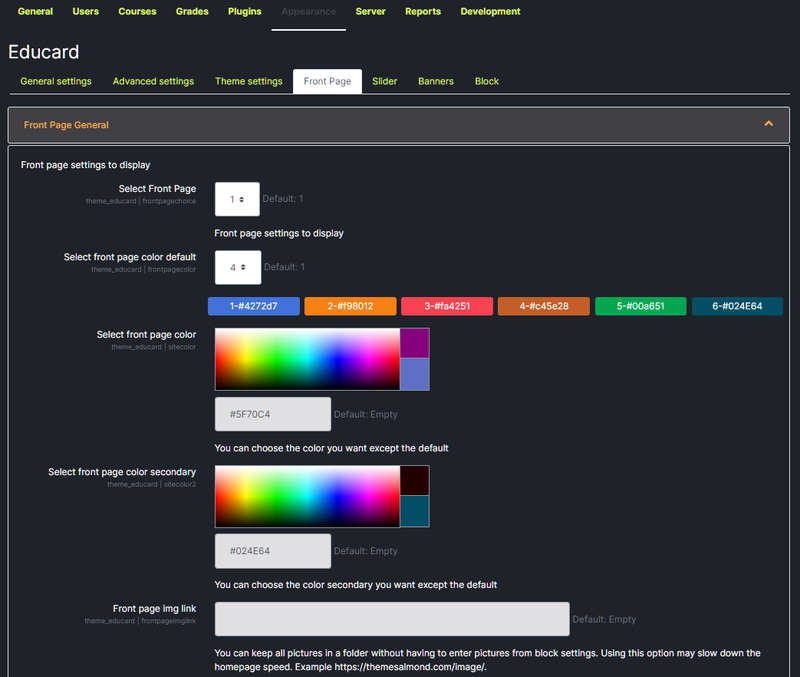
Educard Theme Front Page General desciription :
Select Front Page : You can use it if you don't want to deal with customization. If you want to publish your site quickly using one of the main pages you see on the demo site, it will be a good choice for you. Select the home page number you like and save it. That's it, the home page will now open in the style you selected. Select 'none' if you want to do the customization yourself. If you choose 'None', the 'Front Page Section' section will be active and the blocks you selected from here will be displayed on the main page according to their positions.! WARNING :
1 - All blocks in the home page design you have chosen must be active.
2 - If you have selected a home page design, you can no longer change the positions of the blocks.
3 - It will continue to work even if the slide or banner disable is set in the home page design you have chosen.
Select front page color default : You can choose one of six colors defined as the main color of the theme. 'Select front page color' If the color is selected, this field will be invalid.
Select front page color : Select the theme main color.
Select front page color secondary : Select the second color of the theme.
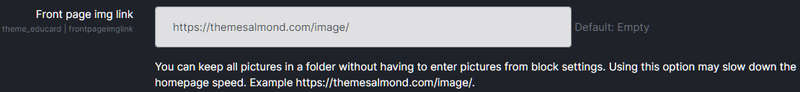
Front page img link : You may want to keep the images used in the theme under a folder or under another domain other than the moodle file system. In this case, enter the full address of the place where you keep the pictures. https://themesalmond.com/image/ gibi.
! WARNING Using this method may cause some slowdown.
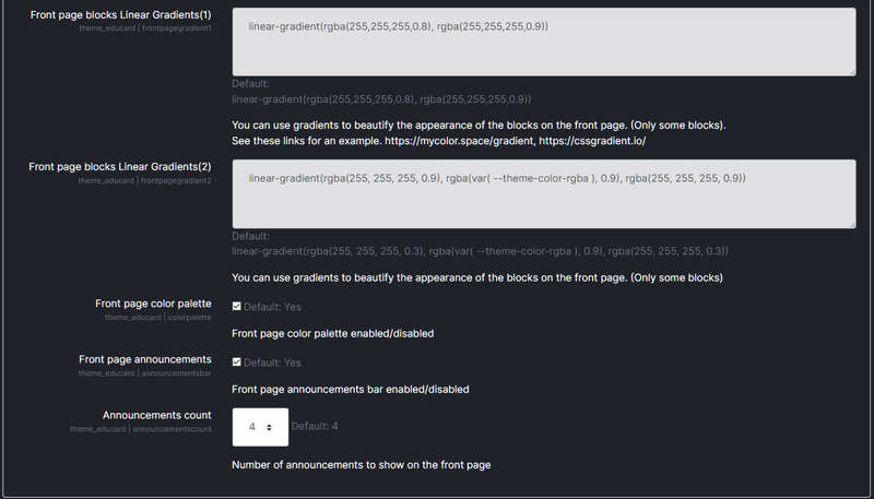
Front page blocks Linear Gradients(1) : You can use gradients in the background to enhance the look of the blocks on the front page. (Some blocks only).
Front page blocks Linear Gradients(2) : Gradients 2
Front page color palette : Enable or disable the color palette that allows your front page visitors to change the site colors.
! WARNING User color options are kept in the Cookie and are stored for 7 days. If the visitor has made color adjustments when the visitor comes back within seven days, the site will be displayed in the colors they have chosen.
Front page announcements : Enable the site announcements bar to appear on the front page. Announcements bar is also shown in different positions based on navbar type.
Announcements count : Enter the number of announcements to be displayed on the front page.
Save Changes Click for your changes to save.

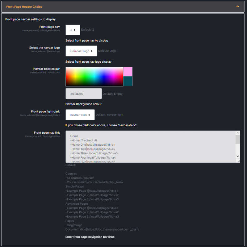
Educard Theme Front Page Header Choice desciription :
Front page nav : You can select the navbar style here.! WARNING :
The navbar 1 is set to appear under the slide or banner.
Select the navbar logo : Select your logo that will appear in the navbar on the front page. Allows you to select the logo that matches the navbar background color. The logo in the Dashboard navbar and the logo in the front page navbar may be different. The logo is used in the Dashboard navbar, you can use the logo or compact logo on the frontpage according to your wishes. (Logos are loaded from Site administration > Appearance > Logos. Educard theme will automatically adjust according to the aspect ratio regardless of the dimensions of your logo. During this adjustment, image clarity may deteriorate depending on the dimensions of the logo. Our recommendation is to use the ideal logo dimensions h:35px x w:185px.)
Navbar back colour : You can choose the navbar background color here. Be careful to choose a color that will not be a problem in dark and light appearance.
Front page light-dark : If you select nav-light, the navbar text will be dark, and if you select Nav-dark, the navbar text will be light.
Front page nav link : Define the navbar dropdown menu items according to the example here. You can open it on a new page by using _blank at the end of the link you provided. If you want to see the menus you created here in the dashboard navbar, you can define them from Site administration > Appearance > Theme settings Custom menu items.
Save Changes Click for your changes to save.
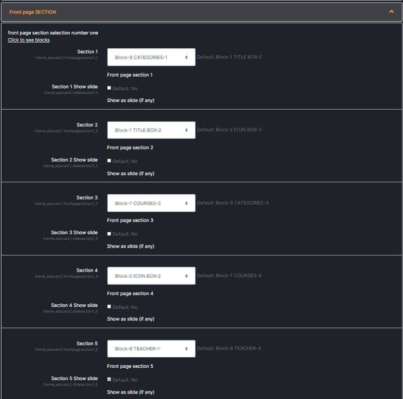
Educard Theme Front Page Section desciription :
You can set the blocks to be placed on the main page, and their positions, and show them as slides from this section. In total, we can display up to ten blocks on the main page, excluding the header banner, header slide and footer. You can sort the blocks according to your taste, you can set some blocks as slides. You can select 'None' in the section where you do not want to show anything. By making all sections 'none', you will get a blank home page by deactivating the banner, slide and footer. If you are confident about html, you can create a completely custom home page by entering the HTML codes you will create specifically for any of the HTML blocks.! WARNING :
Blocks to show need to be enabled in the block settings.
Section 1 : Select the block to be displayed at this location. Some blocks have more than one design, you can see them numbered under the same block name, choose the one that suits you best.
Section 1 Show slide : When you mark it, if the block is suitable for a slide show, it will be shown as a slide on the main page. Some blocks are not shown as slides.
Section 2 :
Section 2 Show slide :
......
......
......
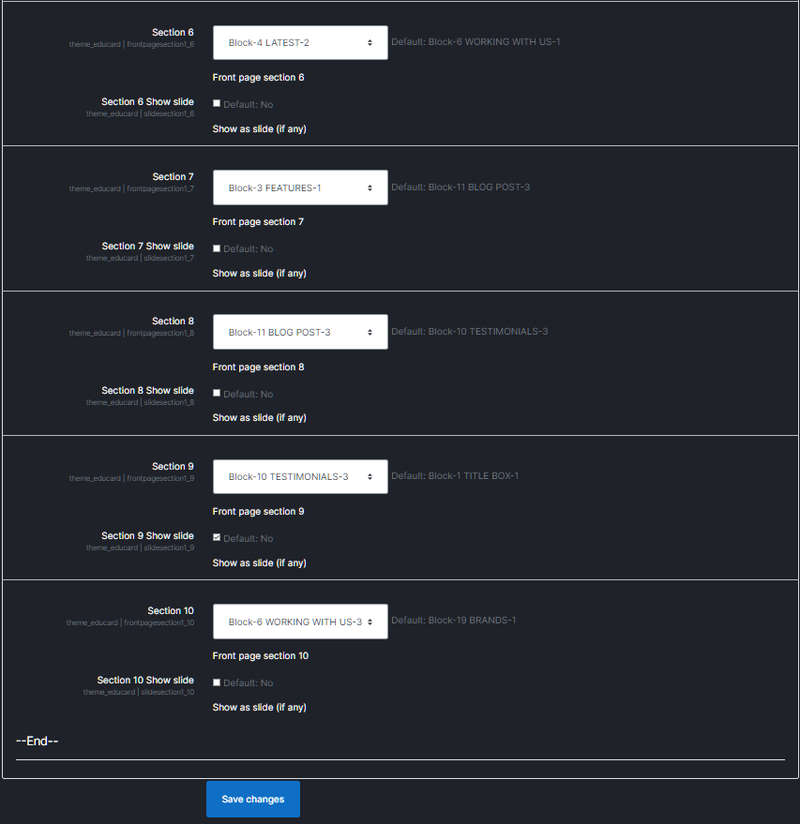
Do the operations in Section 1 for other sections as well.
......
......
Section 10 :
Section 10 Show slide :
Save Changes Click for your changes to save.
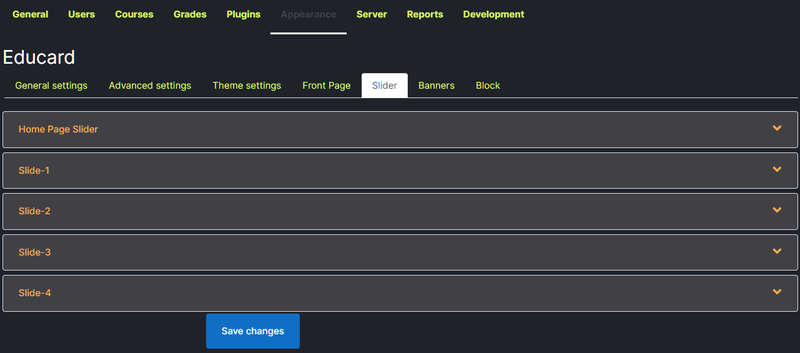
Educard Theme Slider desciription :
You can adjust the slider settings that will be displayed on the home page here. Educard theme has 4 different slider styles. You can choose one of them or disable the slider altogether. You can show a minimum of 1 and a maximum of 10 slides.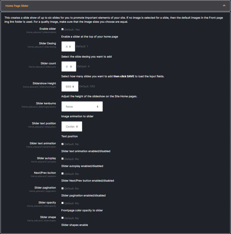
Educard Theme Front Page Slider desciription :
Configure the slider settings here. In some slider designs, some of the settings are invalid.Enable slider :If you want a slider on the homepage, enable it. If you don't want a slider on the homepage, disable it.
! WARNING :
If the slide show is enabled, only the slide will be shown on the home page even if Banners are enabled.
Slider Desing : There are 4 slider designs in Educard theme, choose one of them.
Slider count : You can choose how many slider shows you want here.
Slidershow Height : You can adjust the height of the slider according to the page design. (Valid in design no. 1)
Slider kenburns : Picture animation to the slider is the animation where you can adjust which direction the picture will come from. Choose from eight different options. If you don't want animation, choose 'none'. (Valid in design no. 1)
Slider text position : In the slider, you can adjust the position in which the promotional texts you will use will appear. (Valid in design 1,2,3.)
Slider text animation : If you enable it, the promotional texts that you will use in the slider will appear animated. (Valid in design no. 1,2.)
Slider autoplay :
If you enable it, the slider will move to a new slide every 5 seconds. (Valid in all designs.)
Next/Prev button : You can enable or disable the slider forward-backward icons. You can change their position, top, middle and bottom. (Valid in all designs.)
Slider pagination :
Enable or disable the pointer that shows which slide the slider is on. (Valid in all designs.)
Slider opacity : Enable or disable the filter application in the background. (Valid in design no. 1)
Slider shape : If you enable it, it adds a shape to the Slider. (Valid in designs no. 2.3.)
Save Changes Click for your changes to save.
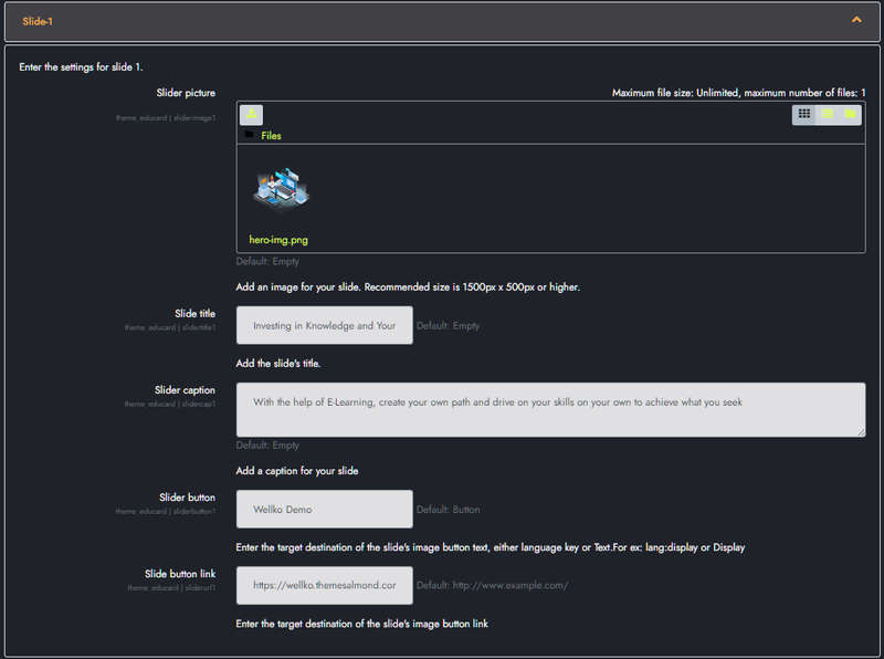
Educard Theme Slide-1, Slide-2, Slide-3.... desciription :
Here we enter the pictures and introductory texts that will be shown on the first slide.Slider picture : The first image to show in the slider will be uploaded here. For a quality look, make sure that the height and width of all the images you choose are equal. Adjust your image dimensions according to the slider height you will use.
! WARNING :
If you do not select an image for the slider and the 'Front page img link' field under the 'Front Page General' tab is full; Educard theme will automatically get the 1.jpg image from the folder named 'image/slider/d1/' in the given link for the slider. You can upload different images to the Image folder according to Slider Design. Educard theme brings the images in the image/slider/d1/ folder if you selected Slider Design 1, if you selected Slider Design 2, it brings the images in image/slider/d2/. 'Front page img link' If the field is empty, a random gradient image generated by moodle will be displayed instead.
Slide title : The title you want to see in the first slider. If you do not want the title to appear, you can leave it blank.
Slider caption : Description for the slider, you can optionally leave it blank.
Slider button : You can add a link button to the slider, optionally leave it blank.
Slide button link : You can write the link code where the link button you added to the slider will go to, optionally you can leave it blank. ( örnek : http://www.example.com/ )
Save Changes Click for your changes to save.
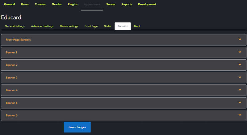
Educard Theme Banners desciription :
You can adjust the settings of the banners to be displayed on the home page here. Educard theme has 6 different styles of banners. You can choose one of them or disable the banners. A separate setting is arranged for each banner. It will be enough to enable the banners to be displayed on the front page and select the banner design number to be displayed. If the sliders are enabled, the banners will not be displayed even if they are enabled.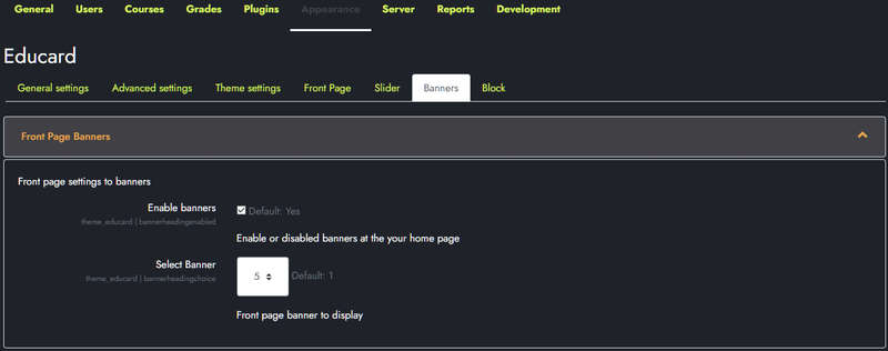
Educard Theme Front Page Banners desciription :
Enable banners :Enable it if you want to see the banner on the home page. If you do not want a banner on the home page, disable it.! WARNING :
If the slide show is enabled, only the slide will be shown on the home page even if Banners are enabled.
Select Banner : There are 6 banner designs in the Educard theme, choose one of them.
Save Changes Click for your changes to save.
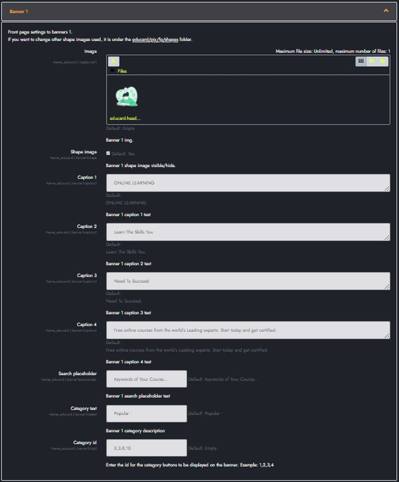
Educard Theme Banner 1 desciription :
We make the first banner settings here.Image : Upload the image to be displayed on the banner here. The image size is automatically adjusted to be 600px high. Do not use very large images in order not to reduce the performance of your site.
Shape image : If you don't want the shape images that add a different feature to the banner to appear, disable it.
Caption 1-2-3-4 : You can write the description text for the banner and the messages suitable for your purpose in 4 headlines.
Search placeholder : You can write an explanation for the search form on this banner.
Category text : Enter a slogan for the categories.
Category id : Enter the category IDs to display. (like 1,2,5,7)
Save Changes Click for your changes to save.


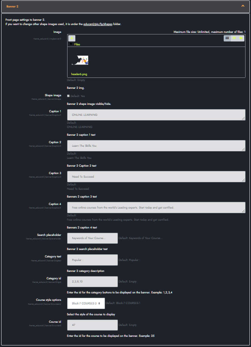
Educard Theme Banner 2 desciription :
We make the second banner settings here.Image : Upload the image to be displayed on the banner here. The image size is automatically adjusted to be 600px high. Do not use very large images in order not to reduce the performance of your site.
Shape image : If you don't want the shape images that add a different feature to the banner to appear, disable it.
Caption 1-2-3-4 : You can write the description text for the banner and the messages suitable for your purpose in 4 headlines.
Search placeholder : You can write an explanation for the search form on this banner.
Category text : Enter a slogan for the categories.
Category id : Enter the category IDs to display. (like 1,2,5,7)
Course style options : Select the design of the course to be displayed on the banner.
Course id : Enter the ID of the course to be displayed on the banner. (like 25..)
Save Changes Click for your changes to save.


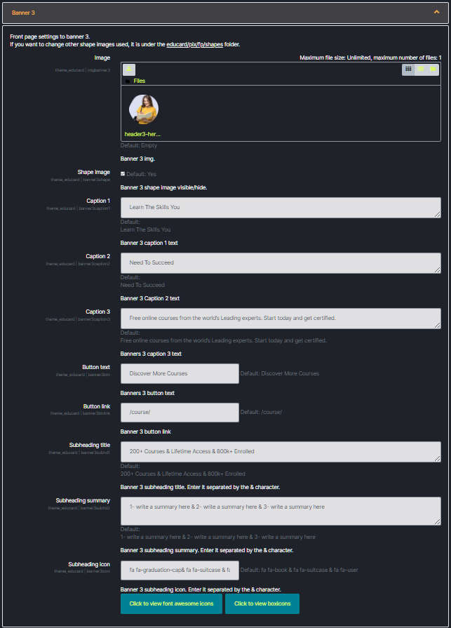
Educard Theme Banner 3 desciription :
We make the third banner settings here.Image : Upload the image to be displayed on the banner here. The image size is automatically adjusted to be 600px high. Do not use very large images in order not to reduce the performance of your site.
Shape image : If you don't want the shape images that add a different feature to the banner to appear, disable it.
Caption 1-2-3 : Description of the banner. You can write 3 slogans for messages suitable for your purpose.
Button text : Text for the button.
Button link : Link for button. (example: To go to the courses page => /course/)
Subheading title : Title for the three boxes at the bottom of the banner. ( example: 1- 200+ Courses & 2- Lifetime Access & 3- 800k+ Enrolled )
Subheading summary : Explanation for the three boxes at the bottom of the banner. ( example: 1- write a summary here & 2- write a summary here & 3- write a summary here )
Subheading icon : Icon for the three tiles at the bottom of the banner. ( example: 1- fa fa-book & 2- fa fa-suitcase & 3- fa fa-user)
Save Changes Click for your changes to save.


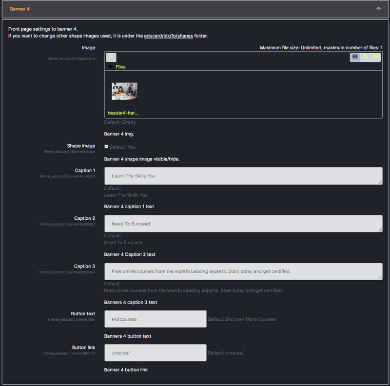
Educard Theme Banner 4 desciription :
Here we make the fourth banner settings.Image : Upload the image to be displayed on the banner here. The image size is automatically adjusted to be 600px high. Do not use very large images in order not to reduce the performance of your site.
Shape image : If you don't want the shape images that add a different feature to the banner to appear, disable it.
Caption 1-2-3 : Description of the banner. You can write 3 slogans for messages suitable for your purpose.
Button text : Text for the button. (example: All Courses)
Button link : Link for button. (example: To go to the courses page => /course/)
Save Changes Click for your changes to save.


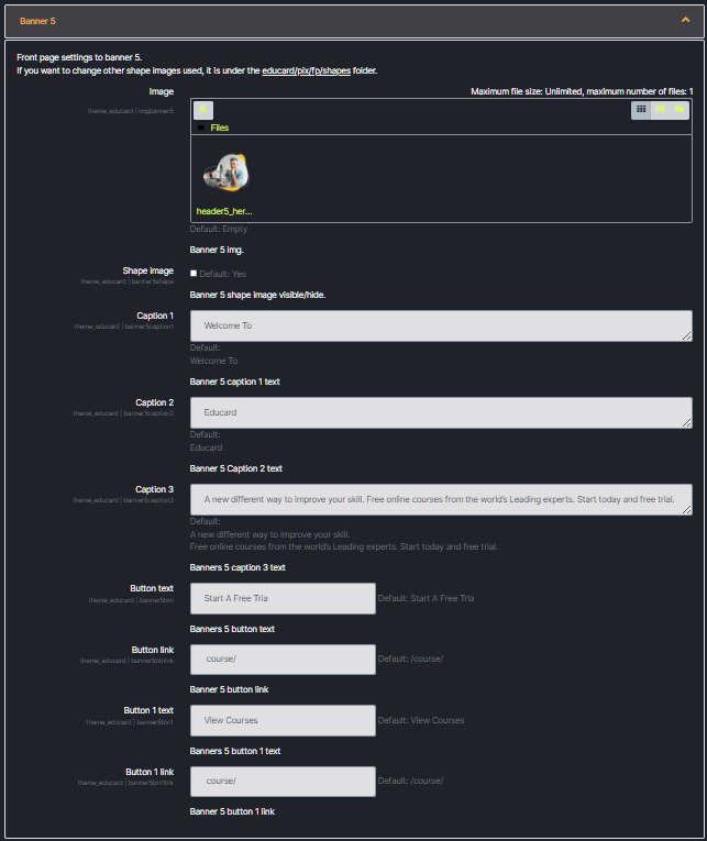
Educard Theme Banner 5 desciription :
We make the fifth banner settings here.Image : Upload the image to be displayed on the banner here. The image size is automatically adjusted to be 600px high. Do not use very large images in order not to reduce the performance of your site.
Shape image : If you don't want the shape images that add a different feature to the banner to appear, disable it.
Caption 1-2-3 : Description of the banner. You can write 3 slogans for messages suitable for your purpose.
Button text : Text for the button. (example: All Courses)
Button link : Link for button. (example: To go to the courses page => /course/)
Button text 1: Text for the second button. (example: All Courses)
Button link 1: Link for the second button. (example: To go to the courses page => /course/)
Save Changes Click for your changes to save.


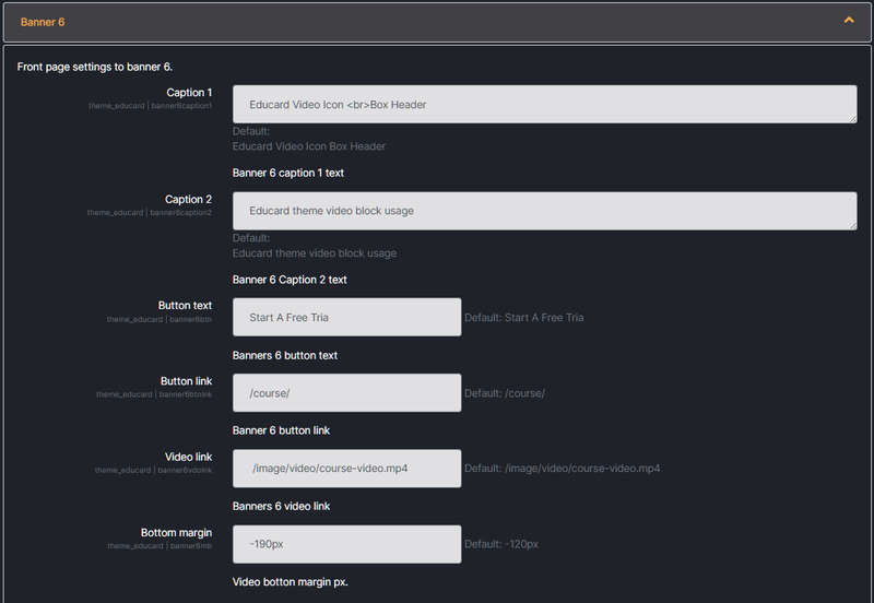
Educard Theme Banner 6 desciription :
Here we make the sixth video banner settings.Caption 1-2 : Description for the poster. You can write 2 slogans for messages suitable for your purpose.
Button text : Text for the button. (example: All Courses)
Button link : Link for button. (example: To go to the courses page => /course/)
Video link : The video link to show on the banner. (example: /image/video/course-video.mp4)
Bottom margin : You can adjust the position of the block that will be displayed just below the video so that it is above the video. (example: -190px)
Save Changes Click for your changes to save.


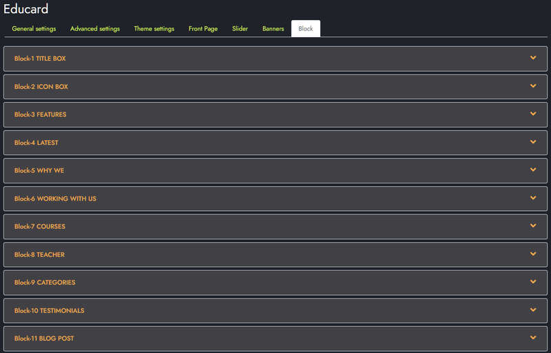
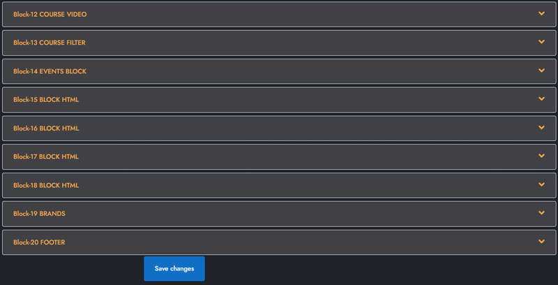
Educard Theme Blocks tab desciription :
Educard theme has 20 blocks to be displayed on the front page. There are different designs of blocks. You can create hundreds of unique homepages with the combinations you will make. Different designs will continue to be added in theme updates. Block content settings are made here. Default contents are automatically created when the theme is installed so you can easily change it.Save Changes Click for your changes to save.
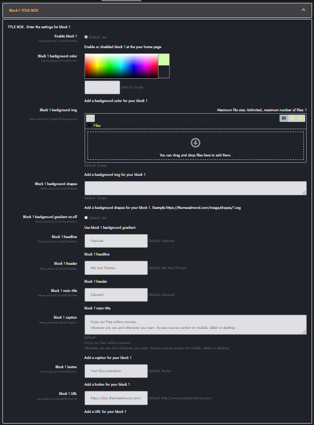
Educard Theme Block-1 TITLE BOX tab desciription :
There are three designs for Title Box. You can create dozens of new looks that you will like by applying different combinations.Enable block 1 : You can disable the block.
The disabled block is not displayed on the front page.
Block 1 background color : You can choose the background color for the block.
If you choose a background color, the background image will be invalid and will not be displayed. If dark theme is selected, background color in designs 2 and 3 and background color and image in design 1 will be impermeable.
Block 1 background img : Here you can add a background image. If the Image folder is active, it takes the pictures from the addresses below;
For First Design ../image/block01/d1/1.jpg
For Second Design ../image/block01/d2/1.jpg
For Third Design ../image/block01/d3/1.jpg
Block 1 parallax : Click the checkbox if you want the background images to be parallax.
Block 1 background shapes :You can put shapes on the background. ( If there is a background image in design 2, it will not be visible.)
Block 1 background gradient on-off : If it is defined, you can use a gradient in the background.
Block 1 headline : Headline text.
Block 1 header : Header text.
Block 1 main title : Main title text.
Block 1 caption : Caption text.
Block 1 button : Button text.
Block 1 URL : Button link.
Save Changes Click for your changes to save.
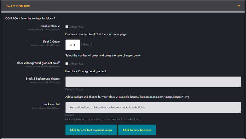
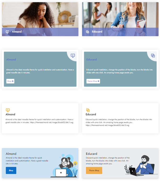
Educard Theme Block-2 ICON BOX tab desciription :
There are four designs for Icon Box. The number of boxes can be 2-3-4. You can create dozens of new looks by applying different combinations.Enable block 2 : You can disable the block.
The disabled block is not displayed on the front page.
Block-2 Count : Choose the number of boxes, minimum 2 and maximum 4 pieces.
Block 2 background gradient on-off : If it is defined, you can use a gradient in the background. When you use a gradient, the background remains as a gradient in dark mode.
Block 2 background shapes : You can put shapes on the background.
Block icon list : You can choose the symbols to use in the boxes. Enter the icon codes separated by commas. You can use Awesome Icons or Boxicons.
(example: bx bx-slideshow, bx bx-outline, bx bx-user-check, bx bxs-graduation)
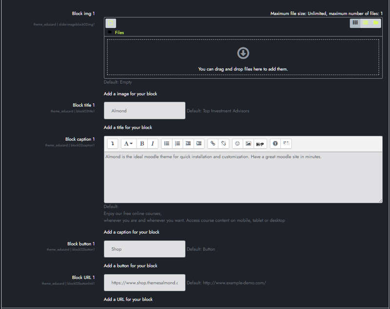
BOX CONTENT :
Block img 1 :You can assign images for Design 1 and 4 here. If you leave it blank, if the image folder is not defined, randomly selected shapes are brought instead of the picture. If the image folder is defined, it takes the pictures from the addresses below;
For First Design ../image/block02/d1/1.jpg
For Fourth Design ../image/block02/d4/1.jpg
Block title 1 : Title text.
Block caption 1 : Caption text.
Block button 1 : Button text.
Block URL 1 : Button Url.
Fill in the other box contents in the same way.
Save Changes Click for your changes to save.
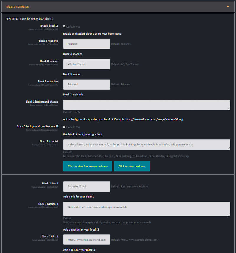
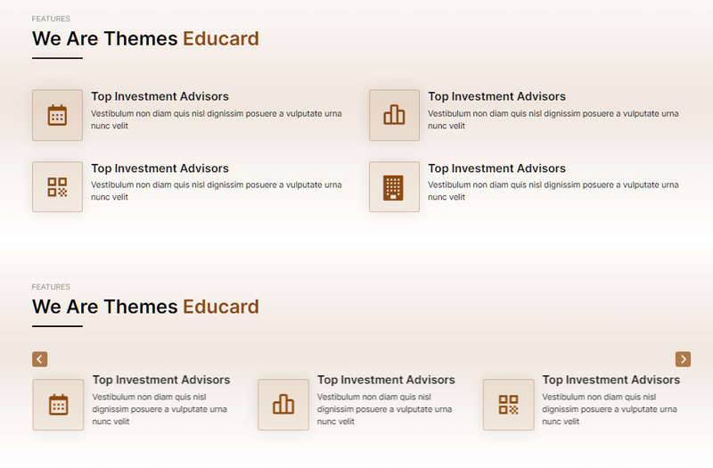
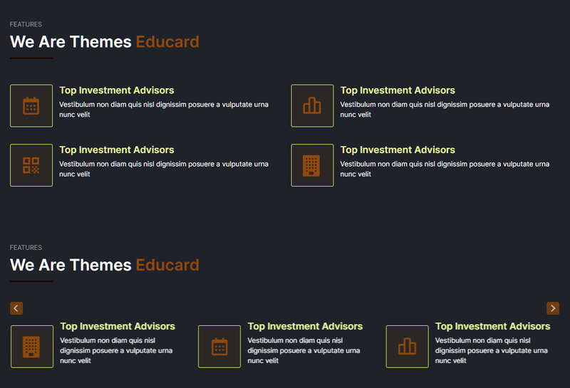
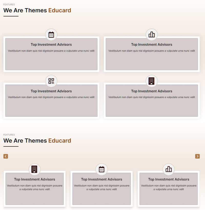
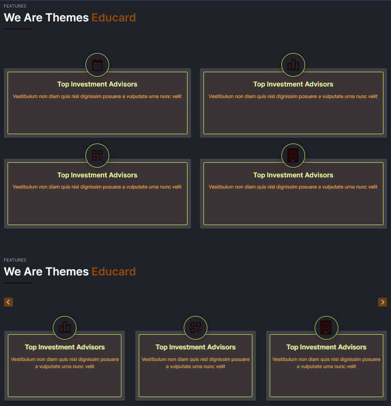
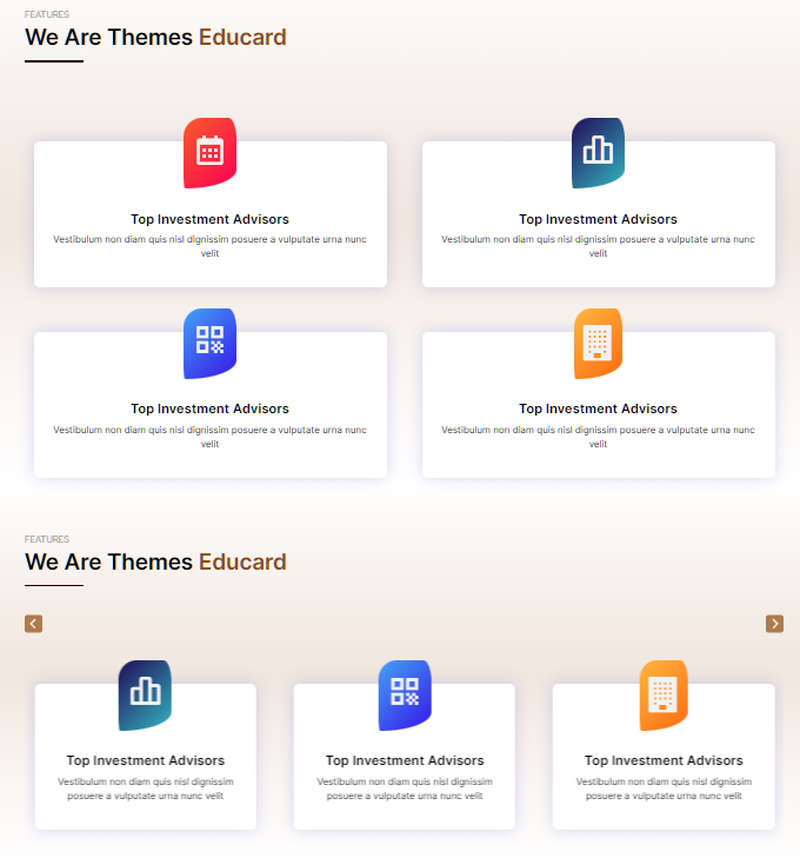
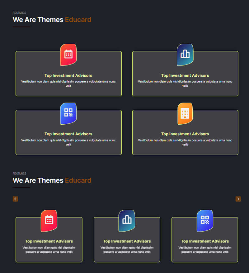
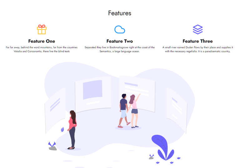
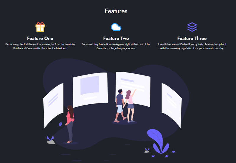
Educard Theme Block-3 FEATURES tab desciription :
There are three different designs for Features. You can set these three different designs as sliders. It consists of six boxes, with an icon on the left side of the boxes and a title and description on the right. If you leave the title and description blank, that box will not appear.Enable block 3 : You can disable the block.
The disabled block is not displayed on the front page.
Block 3 headline : Headline text.
Block 3 header : Header text.
Block 3 main title : Main title text.
Block 3 background shapes : You can put shapes on the background.
Block 3 background gradient on-off : If it is defined, you can use a gradient in the background. The gradient is invalid in dark mode.
Block 3 icon list : You can choose the symbols to use in the block. Enter the icon codes separated by commas. You can use Awesome Icons or Boxicons.
(example: bx bx-slideshow, bx bx-outline, bx bx-user-check, bx bxs-graduation)
BLOCK CONTENT :
Block 3 title 1 to 6 : Enter title.
Block 3 caption 1 to 6 : Enter description.
Block 3 URL 1 to 6 : Icon and Title link.
Fill in the other boxes' contents in the same way.
Save Changes Click for your changes to save.
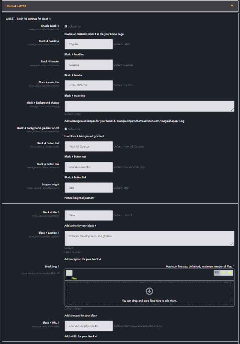
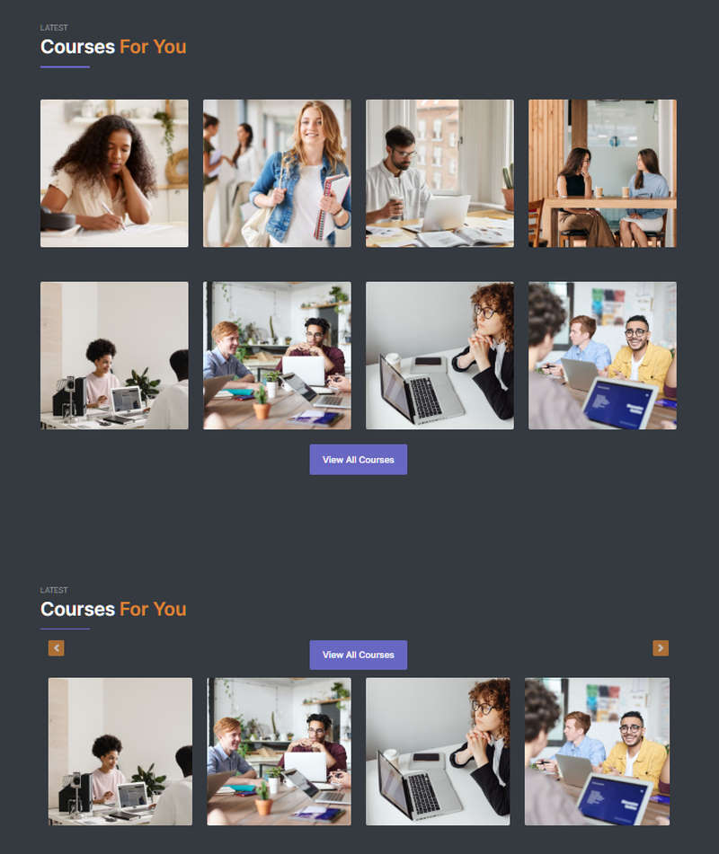
Educard Theme Block-4 LATEST tab desciription :
There are two different designs for the Latest. You can set these two different designs as sliders. It consists of eight boxes, with a picture on the background of the boxes, a button, and a description on the picture.Enable block 4 : You can disable the block.
The disabled block is not displayed on the front page.
Block 4 headline : Headline text.
Block 4 header : Header text.
Block 4 main title : Main title text.
Block 4 background shapes : You can put shapes on the background.
Block 4 background gradient on-off : If it is defined, you can use a gradient in the background. The gradient is invalid in dark mode.
Block 4 button text : Description of the general purpose button for the block.
Block 4 button link : Link for button. (exp.: course/index.php)
Images height: Adjust the size of the images. (default : 400).
BLOCK CONTENT :
Block 4 title 1 to 8 : Enter title.
Block 4 caption 1 to 8 : Enter description.
Block 4 img 1 to 8 : Upload image. If you leave this field blank, if the image folder path is specified, it will automatically take the pictures from the addresses below;
For First Design ../image/block04/d1/1.jpg, 2.jpg, 3.jpg, 4.jpg, 5.jpg, 6.jpg, 7.jpg, 8.jpg
For Second Design ../image/block04/d2/1.jpg, 2.jpg, 3.jpg, 4.jpg, 5.jpg, 6.jpg, 7.jpg, 8.jpg
Block 3 URL 1 to 8 : Header link.
(example : http://www.themesalmond.net/)
Fill in the other boxes' contents in the same way.
Save Changes Click for your changes to save.

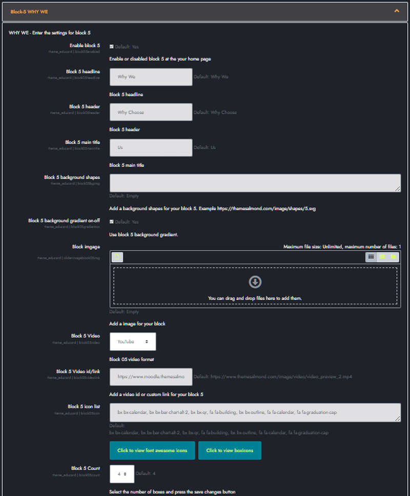
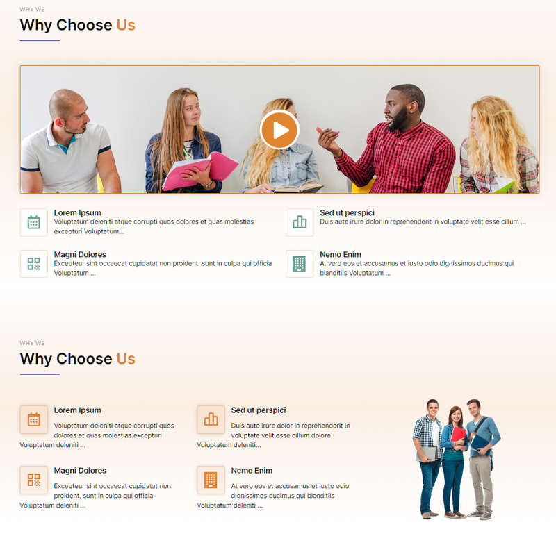
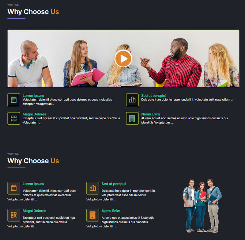
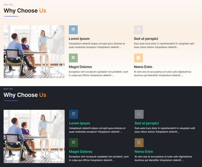
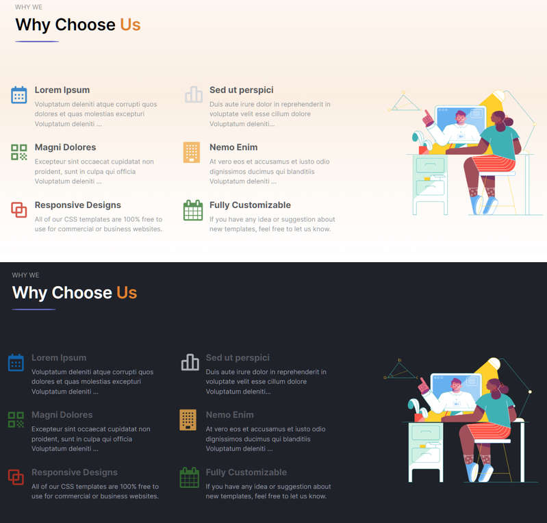
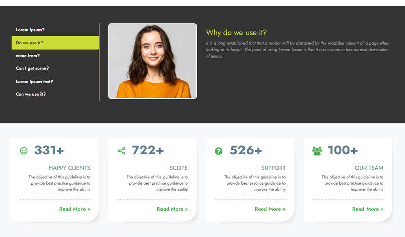
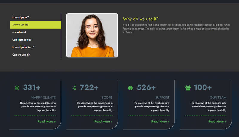
Educard Theme Block-5 WHY WE tab desciription :
There are four different designs for Why we. You can create promotion boxes with at least two and at most eight icons. You can define link URL for icons and titles. You can change the icons.Enable block 5 : You can disable the block.
The disabled block is not displayed on the front page.
Block 5 headline : Headline text.
Block 5 header : Header text.
Block 5 main title : Main title text.
Block 5 background shapes : You can put shapes on the background.
Block 5 background gradient on-off : If it is defined, you can use a gradient in the background. The gradient is invalid in dark mode.
Block imgage : Upload picture. If you leave this field blank, if the image folder path is specified, it will automatically take the pictures from the addresses below;
For First Design ../image/block05/d1/1.jpg
For Second Design ../image/block05/d2/1.jpg
For Third Design ../image/block05/d3/1.jpg
For Fourth Design ../image/block05/d4/1.jpg
With this method, you can define separate images for each design, you don't have to upload new images when you change the design.
Block 5 Video : You can add a video to the number one design. Select the one you want to use from the three video types.
1- Youtube
2- Vimeo
3- Custom
Block 5 Video id/link : Enter the id or link URL of the video to be played according to the video type you selected.
1- Youtube ==> video id 'wzgy-9CV4lg'
2- Vimeo ==> video id '616067179'
3- Custom ==> video link
'https://www.themesalmond.com/image/video/video_preview_2.mp4'
Block 5 icon list You can choose the symbols to use in the block. Enter the icon codes separated by commas. You can use Awesome Icons or Boxicons.
Block 5 Count Select here how many icon promotion boxes you want to create.
BLOCK CONTENT :
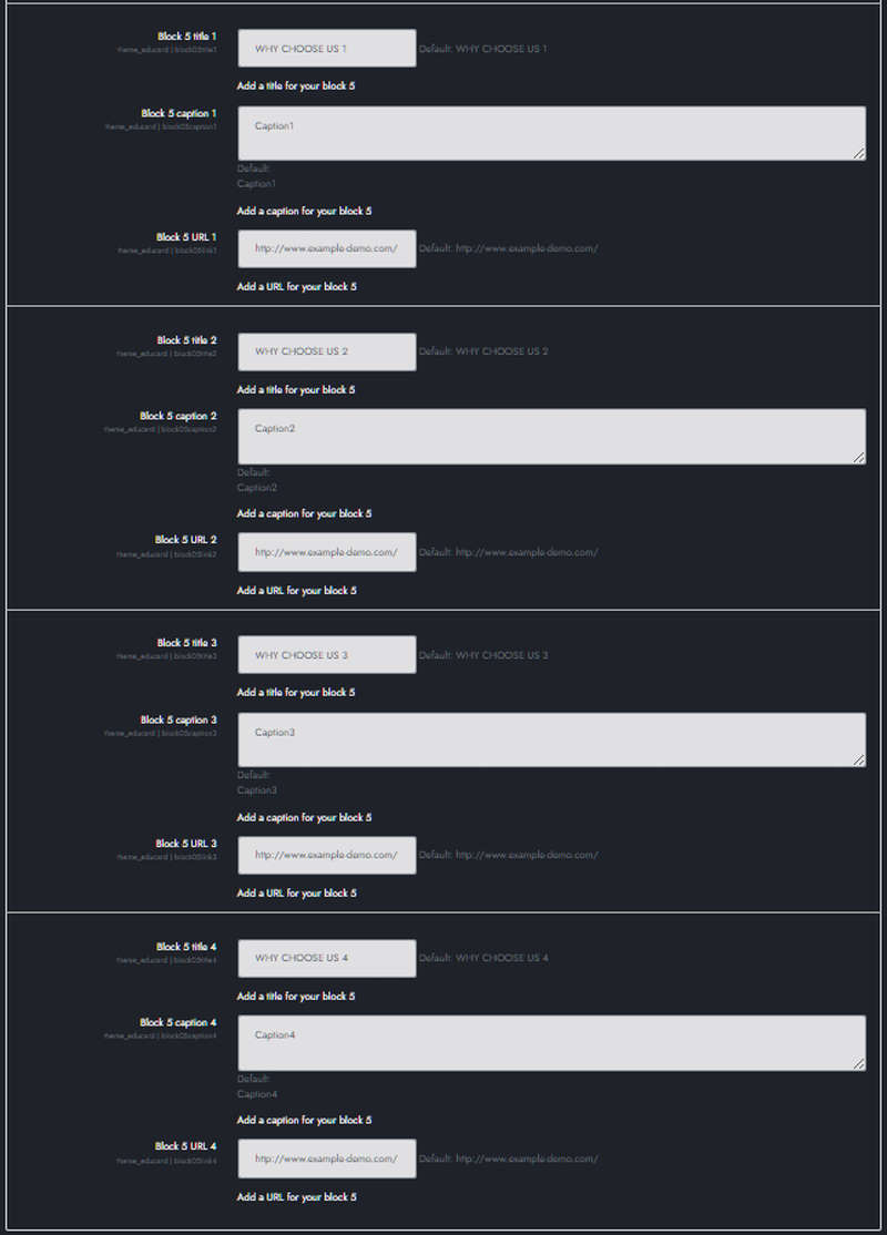
Block 5 title 1 to 8 : Enter title.
Block 5 caption 1 to 8 : Enter description.
Block 5 URL 1 to 8 : Link URL for title and icon.
Fill in the other boxes' contents in the same way.
Save Changes Click for your changes to save.
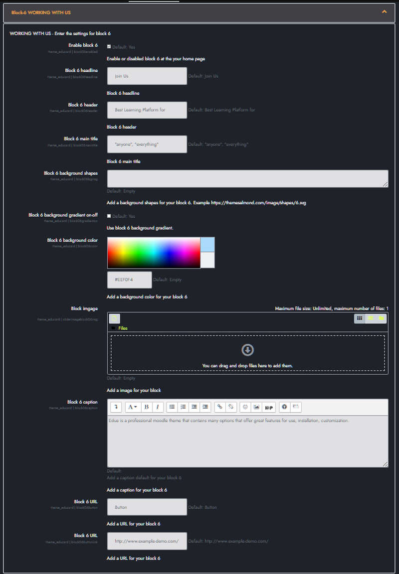
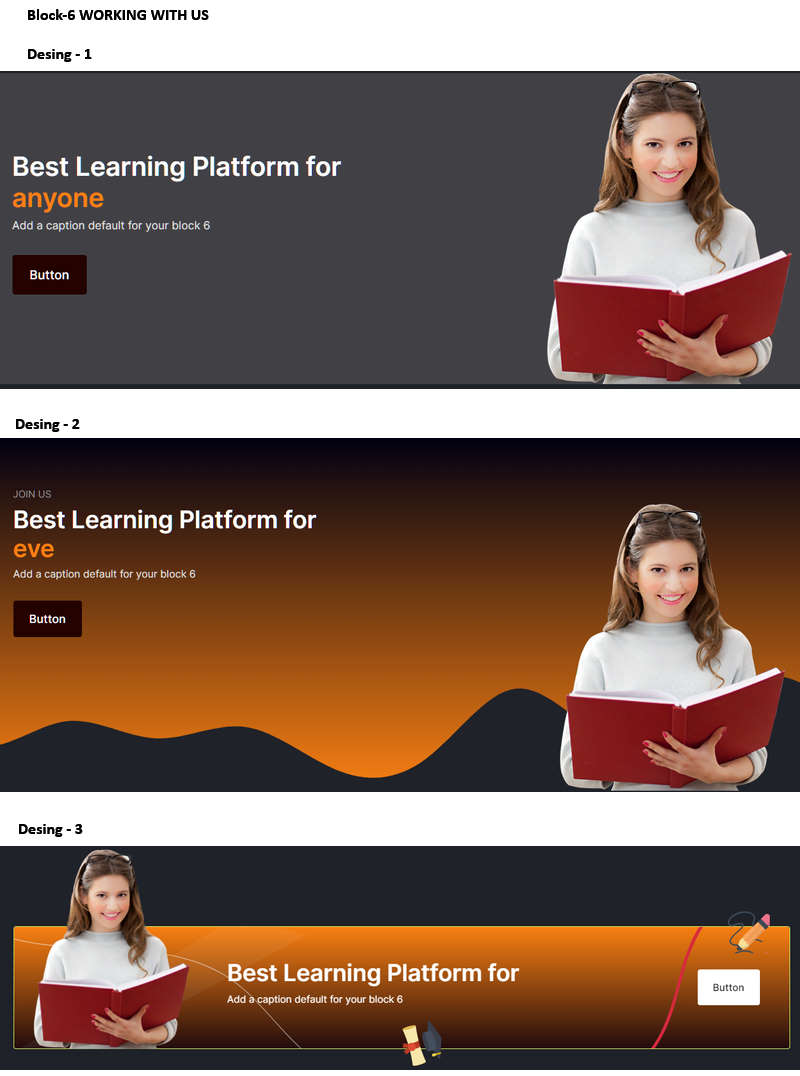
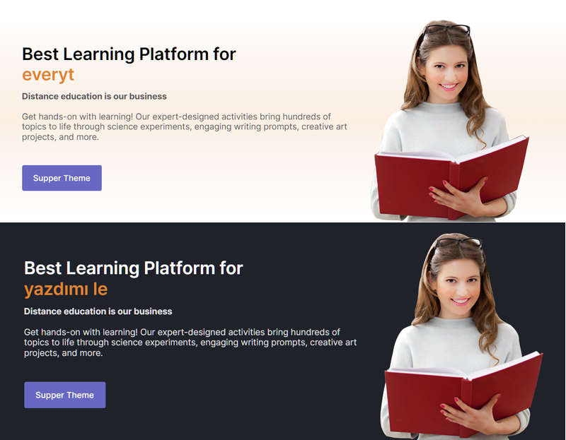
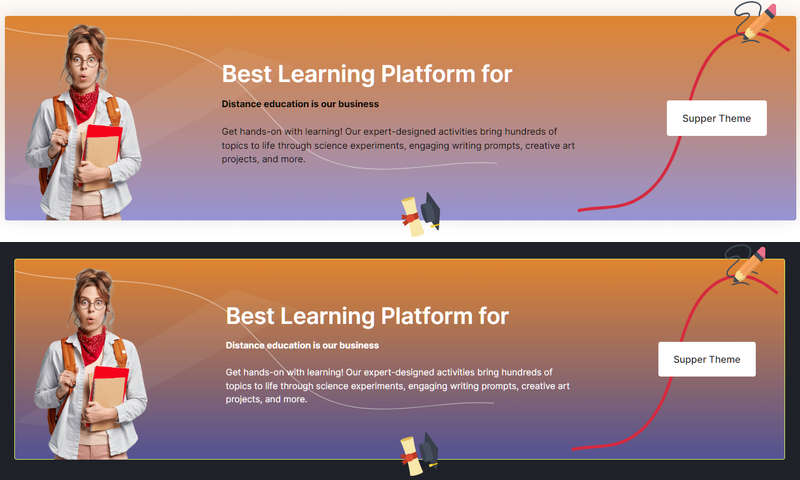
Educard Theme Block-06 WORKING WITH US tab desciription :
Working with us consists of three different designs.Enable block 6 : You can disable the block.
The disabled block is not displayed on the front page.
Block 6 headline : Headline text.
Block 6 header : Header text.
Block 6 main title : Main title text. If you enter text such as "anyone" and "everything" here, was will step in and print the words on the screen in order. It is used only in the first and second designs.
Block 6 background shapes : You can put shapes on the background.
Block 6 background gradient on-off : If it is defined, you can use a gradient in the background. The gradient is invalid in dark mode.
Block 6 background color : It is used only in the first design. Invalid if you choose gradient. Dark mode is also invalid.
Block imgage : Upload picture. If you leave this field blank, if the image folder path is specified, it will automatically take the pictures from the addresses below;
For First Design ../image/block06/d1/1.jpg
For Second Design ../image/block06/d2/1.jpg
For Third Design ../image/block06/d3/1.jpg
With this method, you can define separate images for each design, you don't have to upload new images when you change the design.
Block 6 caption : Enter description.
Block 6 Button text : Enter text for the button. If you don't want a button, leave this field blank.
Block 6 Button URL Enter the link URL for the button.
Save Changes Click for your changes to save.

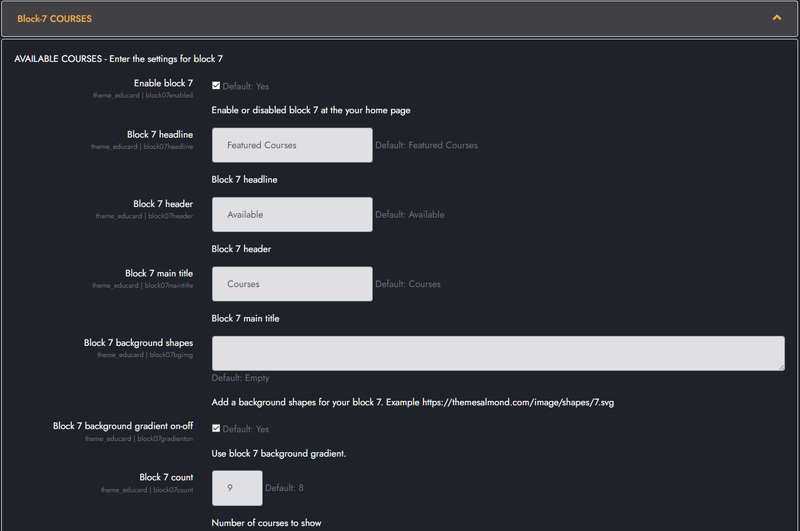
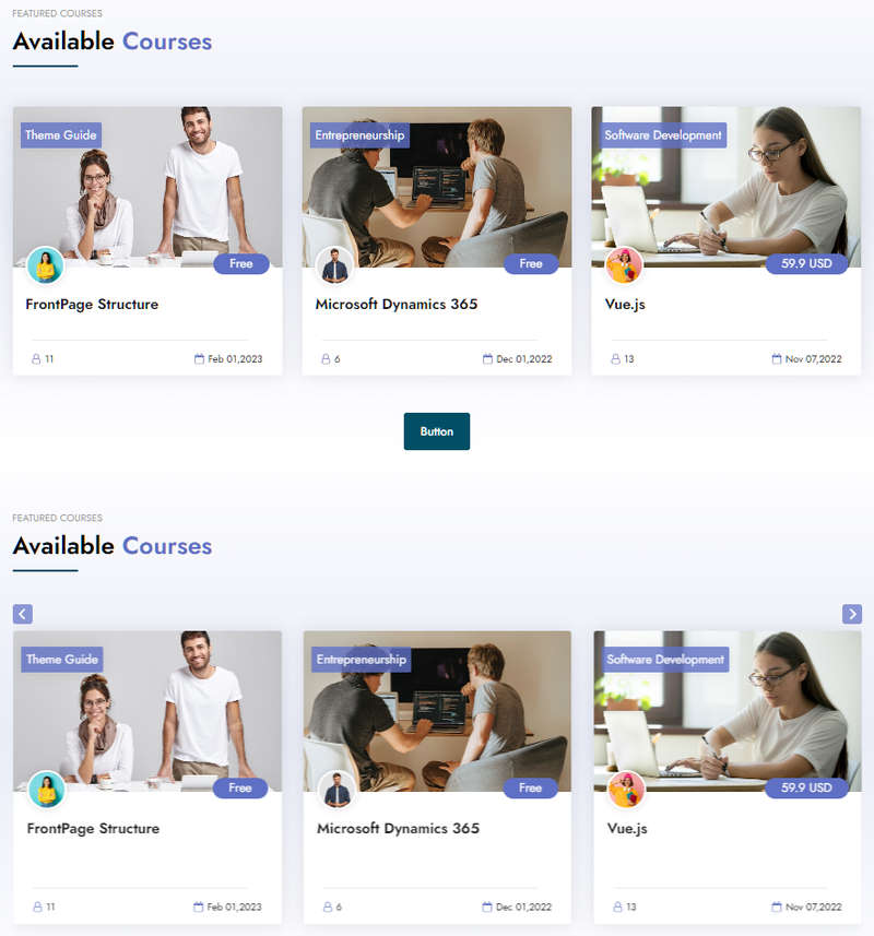
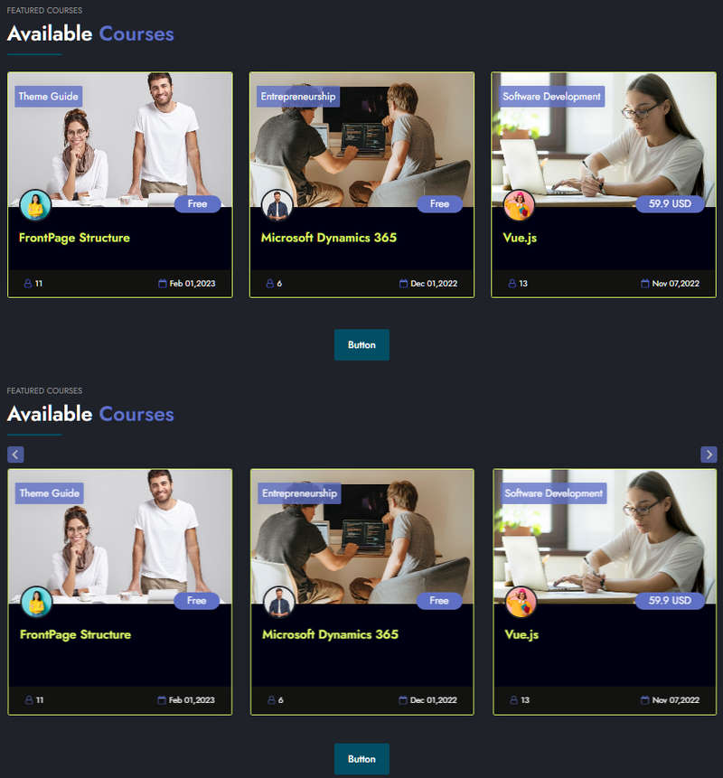
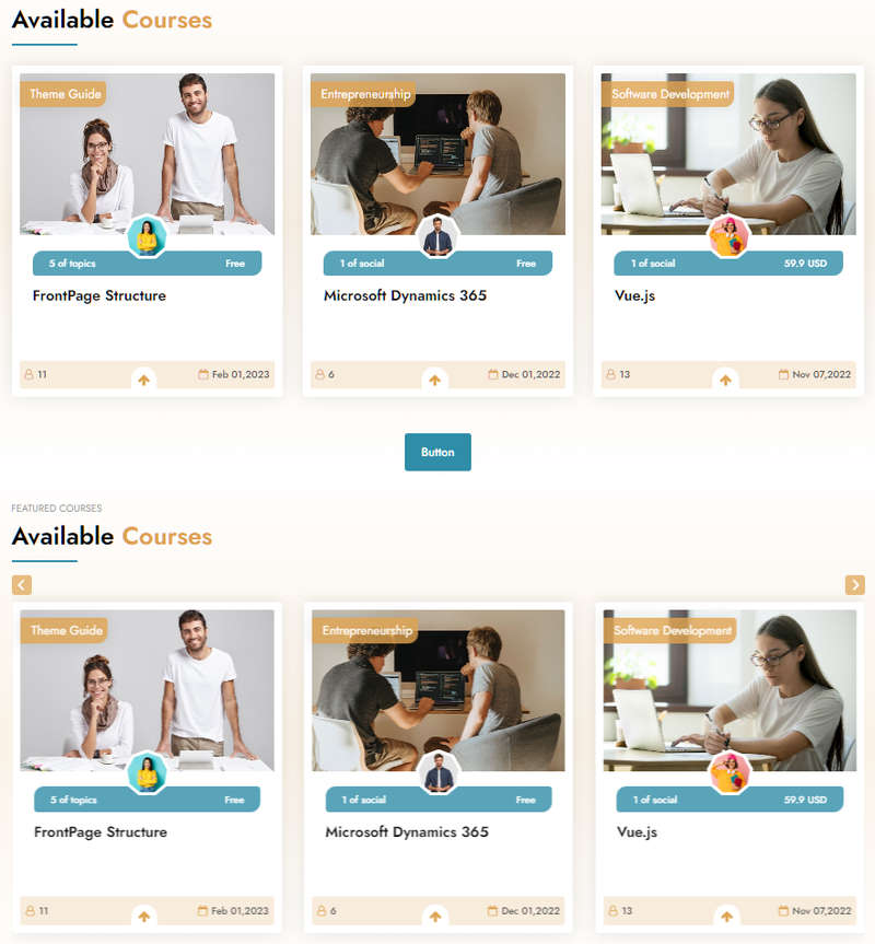
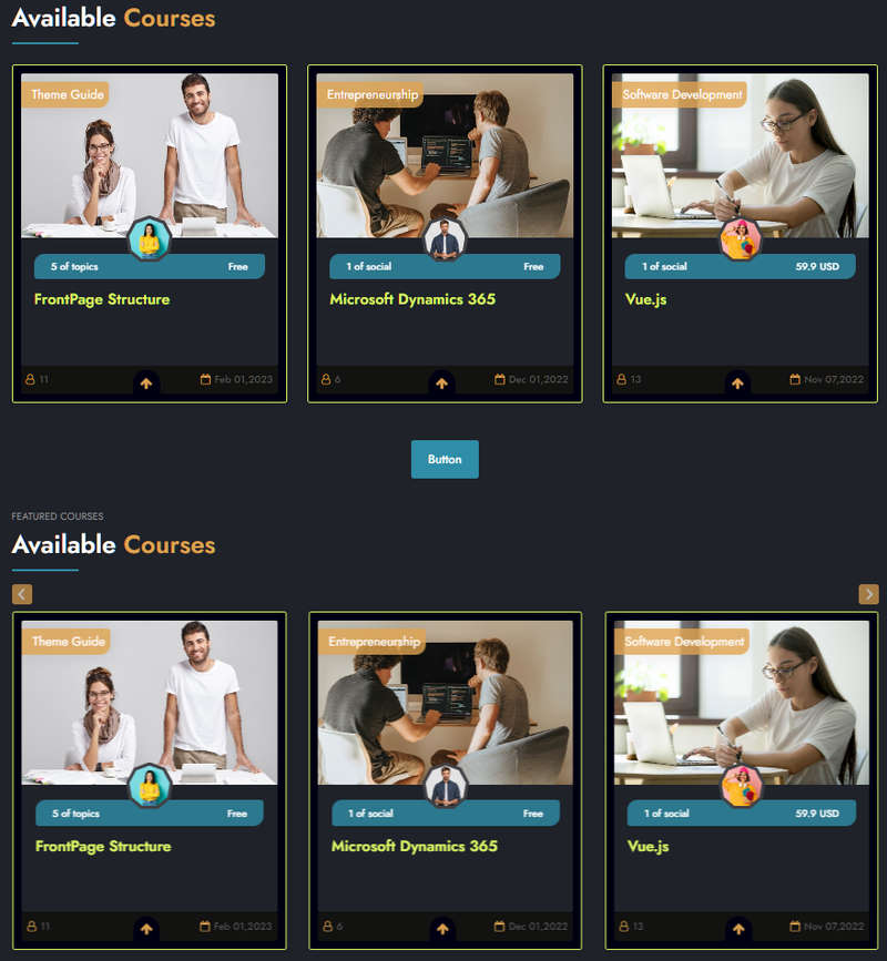
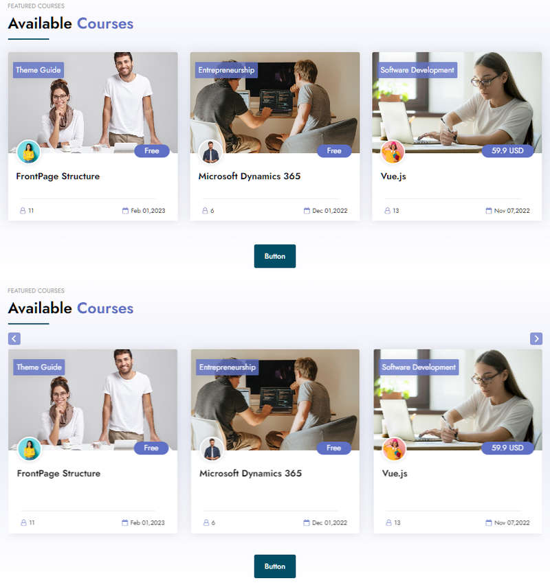
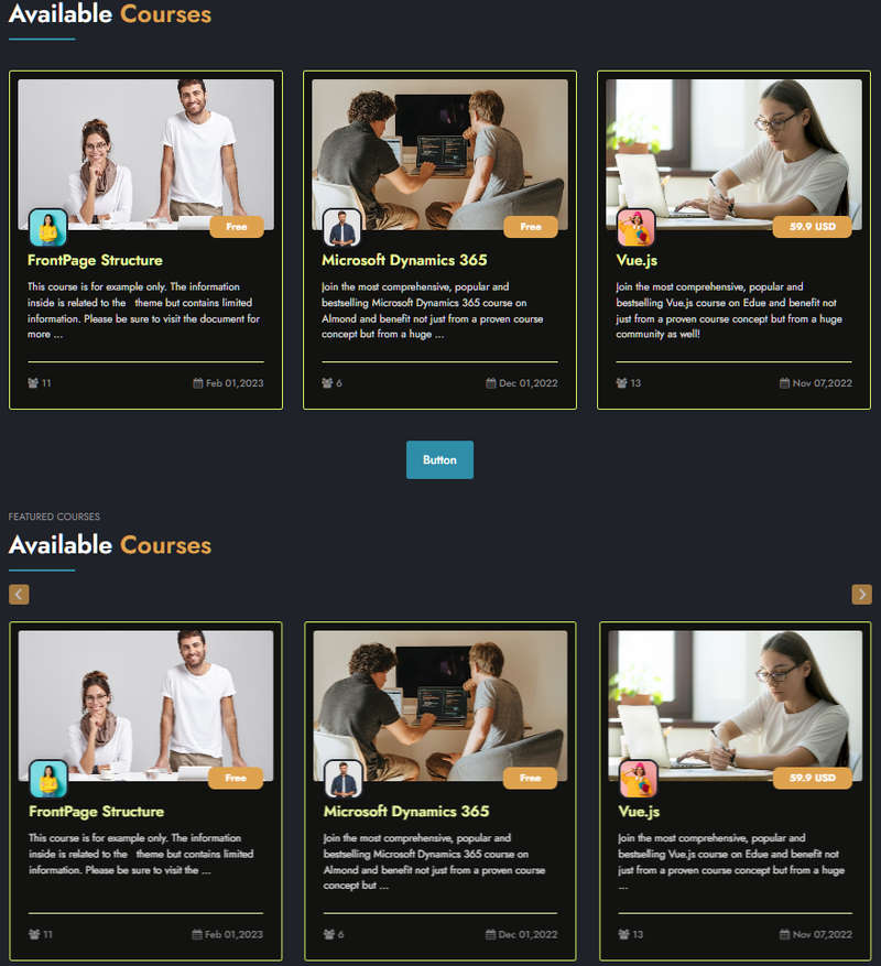
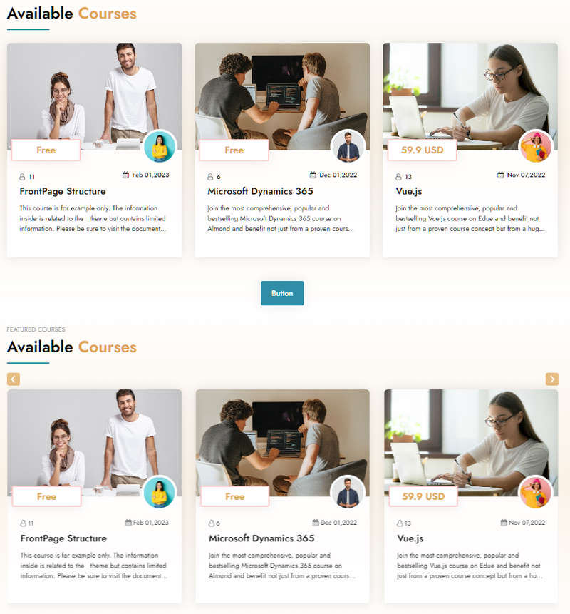
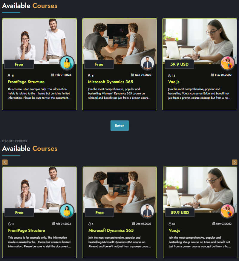
Educard Theme Block-07 COURSES tab desciription :
There are four different designs for the Courses block. Moodle displays the course information you enter on the main page according to various options. You can create different designs by changing the options. You can turn all designs into sliders with one click.Enable block 7 : You can disable the block.
The disabled block is not displayed on the front page.
Block 7 headline : Headline text.
Block 7 header : Header text.
Block 7 main title : Main title text.
Block 7 background shapes : You can put shapes on the background.
Block 7 background gradient on-off : If it is defined, you can use a gradient in the background. The gradient is invalid in dark mode.
Block 7 count : Enter the number of courses you want to show on the home page.
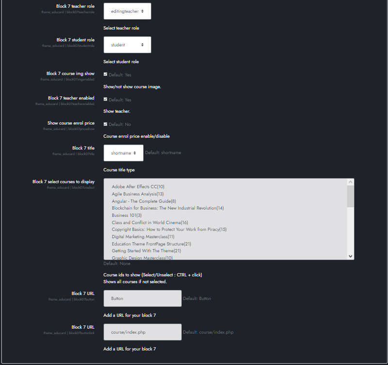
Block 7 teacher role : Enter the role of the educators you want to show on the course. The default is 'editingteacher'.
Block 7 student role : Select the student role. The default is 'student'.
Block 7 course img show : If you do not want the course images to appear on the home page, disable them. When you disable this field, you will get a different course block design.
Block 7 teacher enabled Enable this if you want the teacher picture and name to appear in the course block. Teachers must be assigned to courses via moodle to be visible.
Show course enrol price Activate this if you want the course fee to appear in the course block. In order to view the course fee, the course fee must be entered via moodle.
Block 7 title Set the course name to appear long or short in the course block here.
Block 7 select courses to display Here you can select the courses you want to appear in the course block. Ctrl + click for multiple selection. If you do not select any course, the courses in the system will be displayed in the order you want to show, starting from the last updated course.
Block 7 button text General purpose button text for the course block.
Block 7 button URL General purpose button URL for the course block.
Save Changes Click for your changes to save.
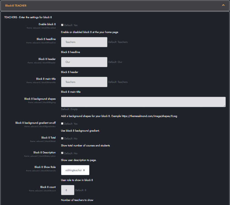
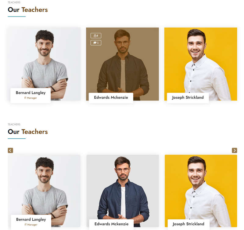
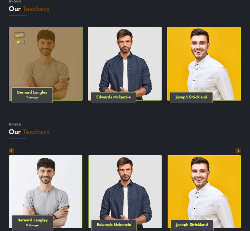
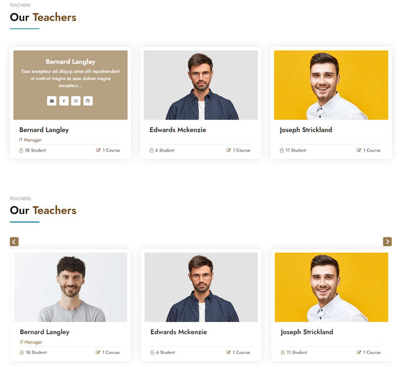
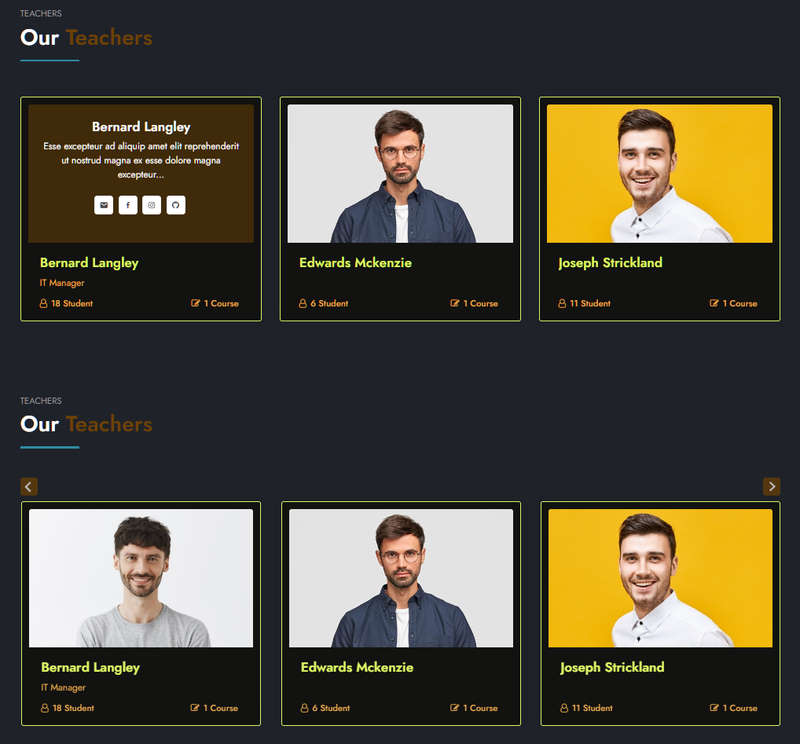
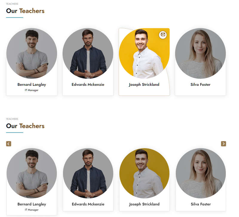
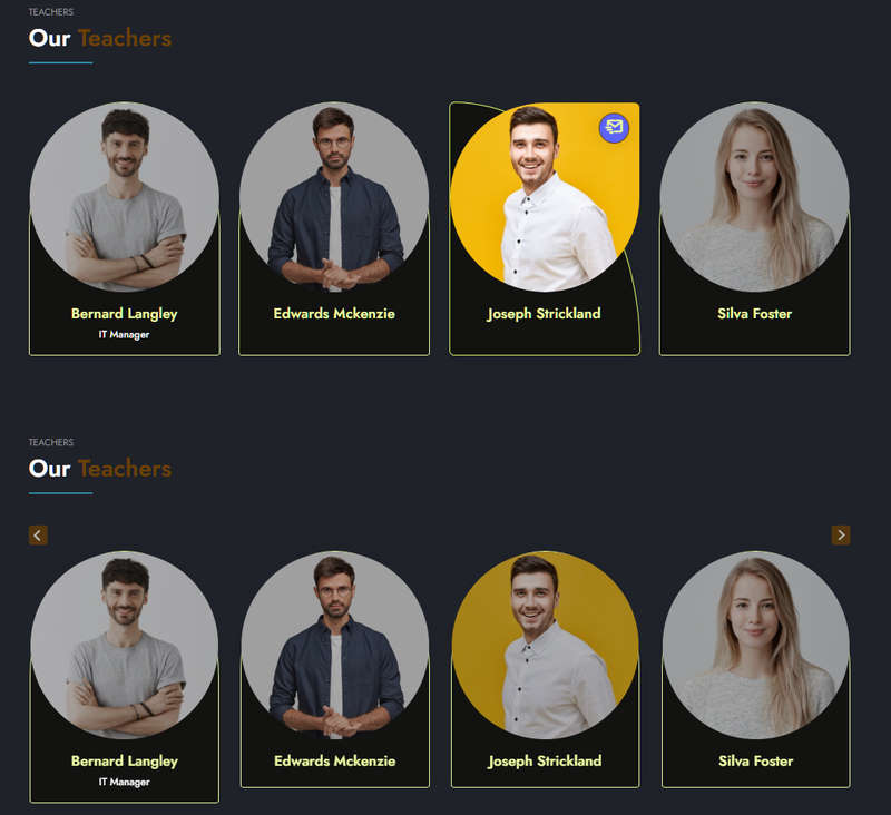
Educard Theme Block-08 TEACHER tab desciription :
The teacher block consists of four different designs. Among the users you enter in Moodle, those included in the role you choose are displayed on the main page according to various options. You can create different designs by changing the options. You can turn all designs into sliders with one click. If you want to show only the users you want, define a new role, assign this role to the users you want to show and select the role you defined from 'Show Role'.Enable block 8 : You can disable the block.
The disabled block is not displayed on the front page.
Block 8 headline : Headline text.
Block 8 header : Header text.
Block 8 main title : Main title text.
Block 8 background shapes : You can put shapes on the background.
Block 8 background gradient on-off : If it is defined, you can use a gradient in the background. The gradient is invalid in dark mode.
Block 8 total : Show the total number of courses and students for the teacher if you enable it.
Block 8 Description : If you enable it, it will show the description in the teacher's profile.
Block 8 Show Role : Enter the role of the trainers you will show. The default is 'editingteacher'.
Block 8 count : Enter the number of teachers you want to show on the home page.
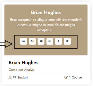
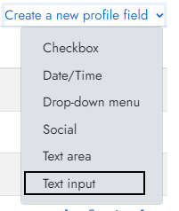
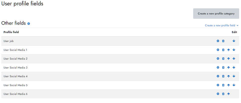
Short name : 'userjob', Name : 'User job'.
Short name : 'usersocial1' Name : 'User Social Media 1'.
Short name : 'usersocial2' Name : 'User Social Media 2'.
Short name : 'usersocial3' Name : 'User Social Media 3'.
Short name : 'usersocial4' Name : 'User Social Media 4'.
Short name : 'usersocial5' Name : 'User Social Media 5'.
Short name : 'usersocial6' Name : 'User Social Media 6'.
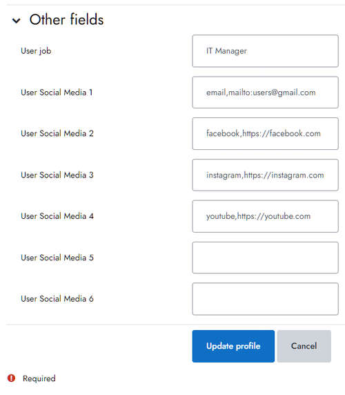
 Now we will define social media links to users. For this we go to the user's profile. Then, Click
'Edit profile' Then click 'Other fields'
Below is the list of available social media.
First we write the social media name and put a comma, then we write the user's social media link URL.
Now we will define social media links to users. For this we go to the user's profile. Then, Click
'Edit profile' Then click 'Other fields'
Below is the list of available social media.
First we write the social media name and put a comma, then we write the user's social media link URL.
facebook, https://facebook.com/almondThemes
twitter, https://twitter.com
instagram, https://instagram.com
linkedin, https://linkedin.com
youtube, https://youtube.com
pinterest, https://pinterest.com
dribbble, https://dribbble.com
email, mailto:support@themesalmond.com
medium, https://medium.com
github, https://github.com
figma, https://figma.com
snapchat, https://snapchat.com
 When the teacher role is assigned to the users with social media definition,
you can see the social media connection icons in the teachers block.
When the teacher role is assigned to the users with social media definition,
you can see the social media connection icons in the teachers block.
Save Changes Click for your changes to save.
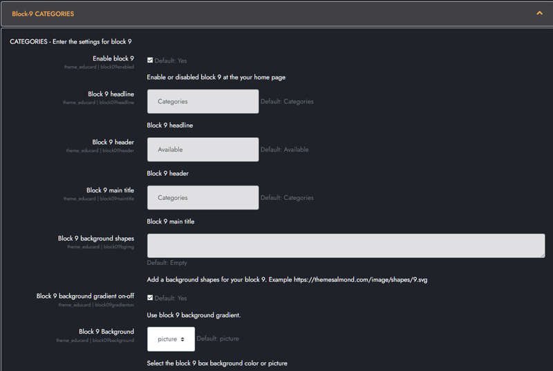
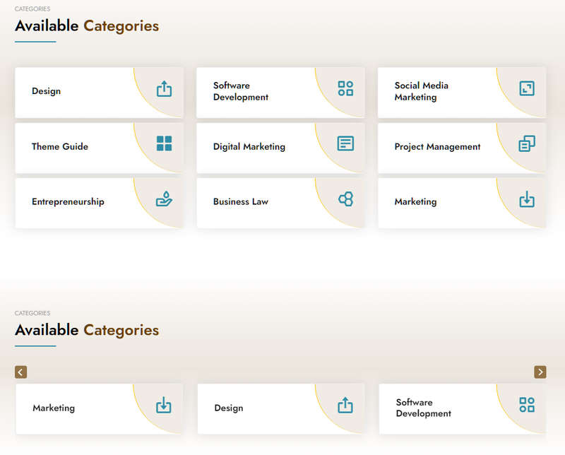
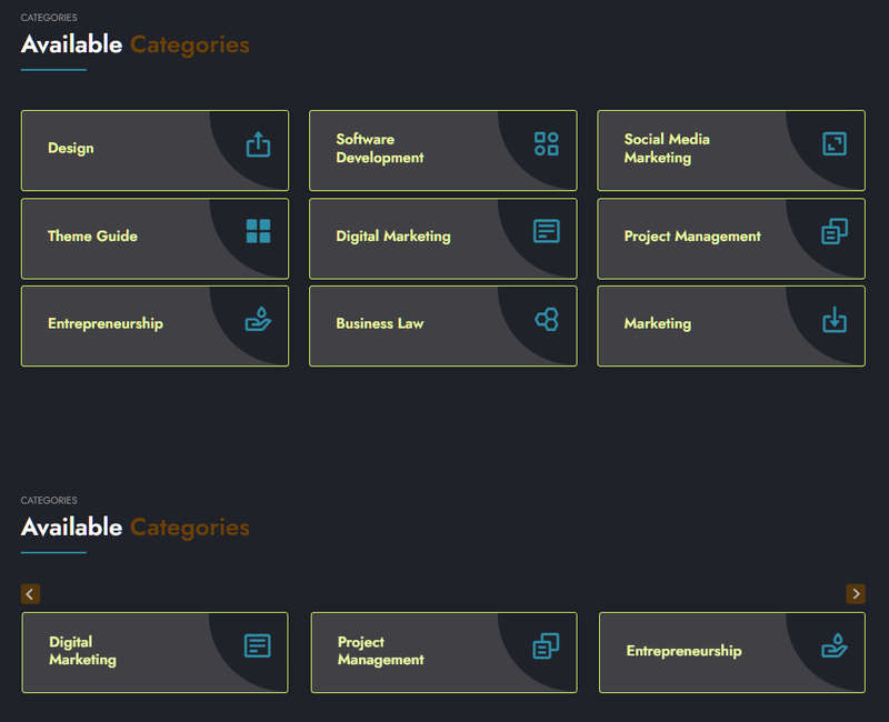
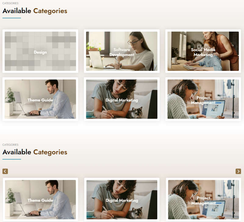
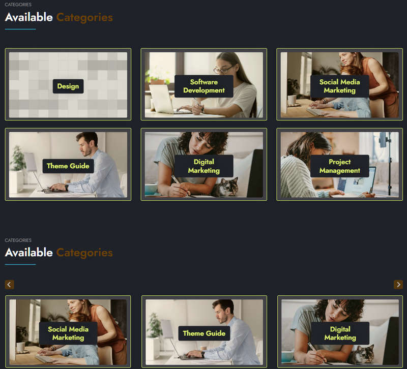
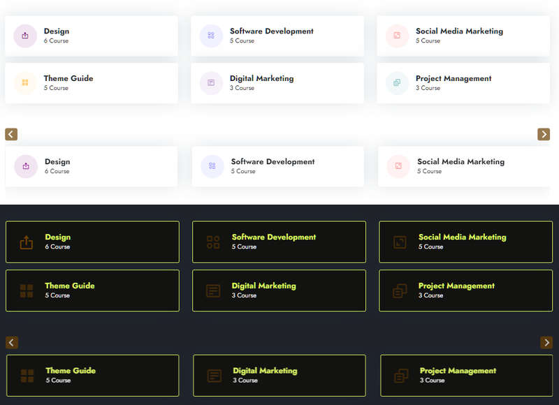
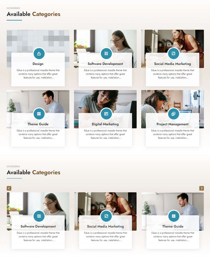
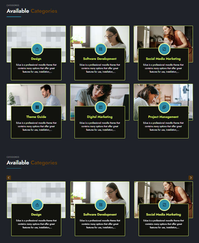
Educard Theme Block-09 CATEGORIES tab desciription :
There are four different designs for the Categories block. Moodle displays the category information you entered on the main page according to various options. You can create different designs by changing the options. You can turn all designs into sliders with one click.Enable block 9 : You can disable the block.
The disabled block is not displayed on the front page.
Block 9 headline : Headline text.
Block 9 header : Header text.
Block 9 main title : Main title text.
Block 9 background shapes : You can put shapes on the background.
Block 9 background gradient on-off : If it is defined, you can use a gradient in the background. The gradient is invalid in dark mode.
Block 9 Background : There are three options for the category block tiles background. These are blank, color and image. If you don't want a background, leave it blank. If you choose a color, it will put randomly generated colors on the background. If you select an image, it takes the image of the first course in the category and puts it in the background. The background option is not available for designs one and three.
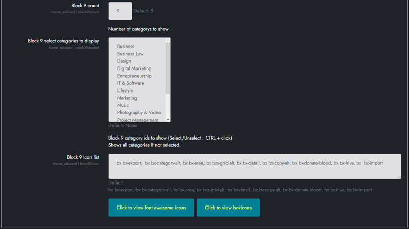
Block 9 count : The number of categories you want to show on the home page.
Block 9 select categories to display : You can select the Categories you want to appear in the block. Ctrl + click for multiple selection. If you do not select any category, it will show the category definitions in the system as many times as you want since the last update.
Block 9 Icon list : You can choose the symbols to use in the block. Enter the icon codes separated by commas. You can use Awesome Icons or Boxicons. (Örnek: bx bx-export,bx bx-category-alt,bx bx-area,bx bxs-grid-alt,bx bx-detail,bx bx-copy-alt,bx bx-donate-blood, bx bx-hive,bx bx-import)
Save Changes Click for your changes to save.
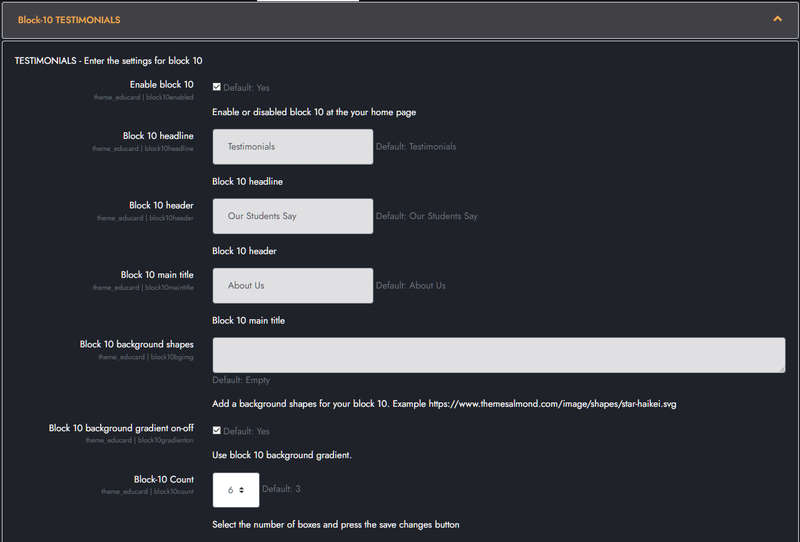
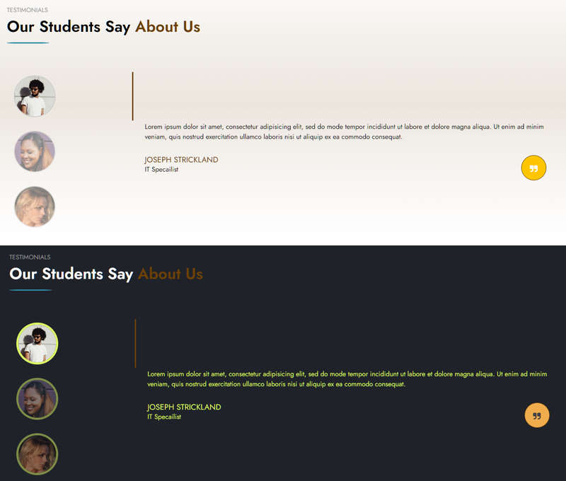
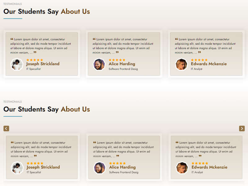
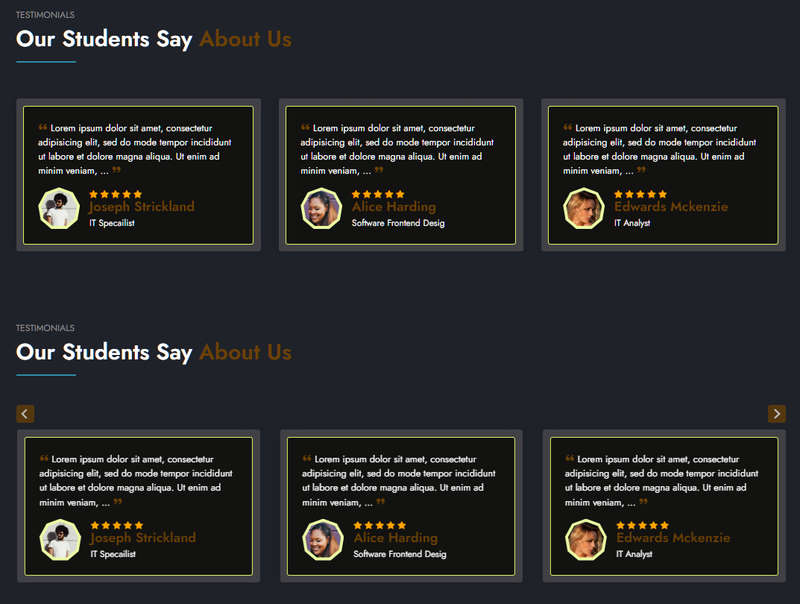
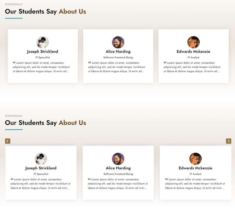
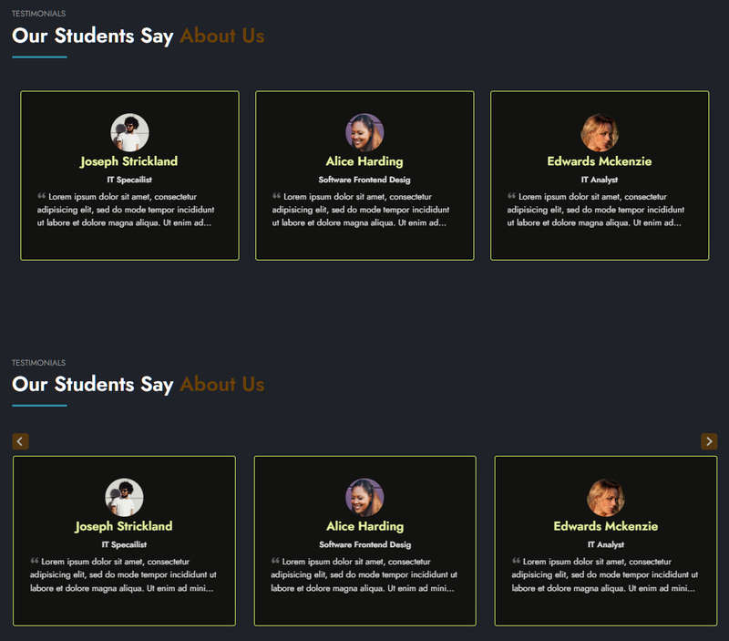
Educard Theme Block-10 TESTIMONIALS tab desciription :
There are three designs for the testimonials block. The number of references can be from 2 to 8. You can create dozens of new looks by applying different combinations.Enable block 10 : You can disable the block.
The disabled block is not displayed on the front page.
Block 10 headline : Headline text.
Block 10 header : Header text.
Block 10 main title : Main title text.
Block 10 background shapes : You can put shapes on the background.
Block 10 background gradient on-off : If it is defined, you can use a gradient in the background. The gradient is invalid in dark mode.
Block-10 Count : Select the number of references, minimum 2 maximum 8 pieces.
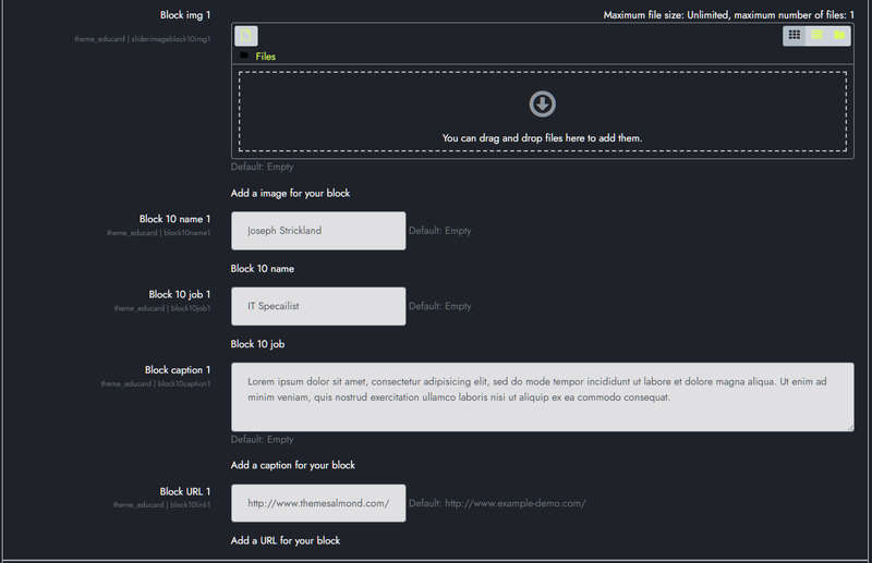
BLOCK CONTENT:
Block img 1 : You can assign a picture here. If you leave it blank, if the image folder is not defined, randomly selected shapes are brought instead of the picture. If the image folder is defined, it takes the pictures from the addresses below;
For First Design ../image/block10/d1/1.jpg, 2.jpg, 3.jpg, 4.jpg, 5.jpg, 6.jpg, 7.jpg, 8.jpg
For Second Design ../image/block10/d2/1.jpg, 2.jpg, 3.jpg, 4.jpg, 5.jpg, 6.jpg, 7.jpg, 8.jpg
For Third Design ../image/block10/d3/1.jpg, 2.jpg, 3.jpg, 4.jpg, 5.jpg, 6.jpg, 7.jpg, 8.jpg
Block 10 name 1 : The name of the person or institution.
Block 10 job 1 : Business or line of business.
Block caption 1 : Explanation.
Block URL 1 : Link URL.
Fill in the other contents in the same way.
Save Changes Click for your changes to save.
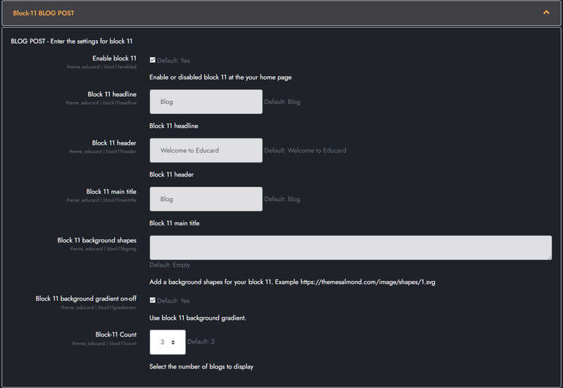
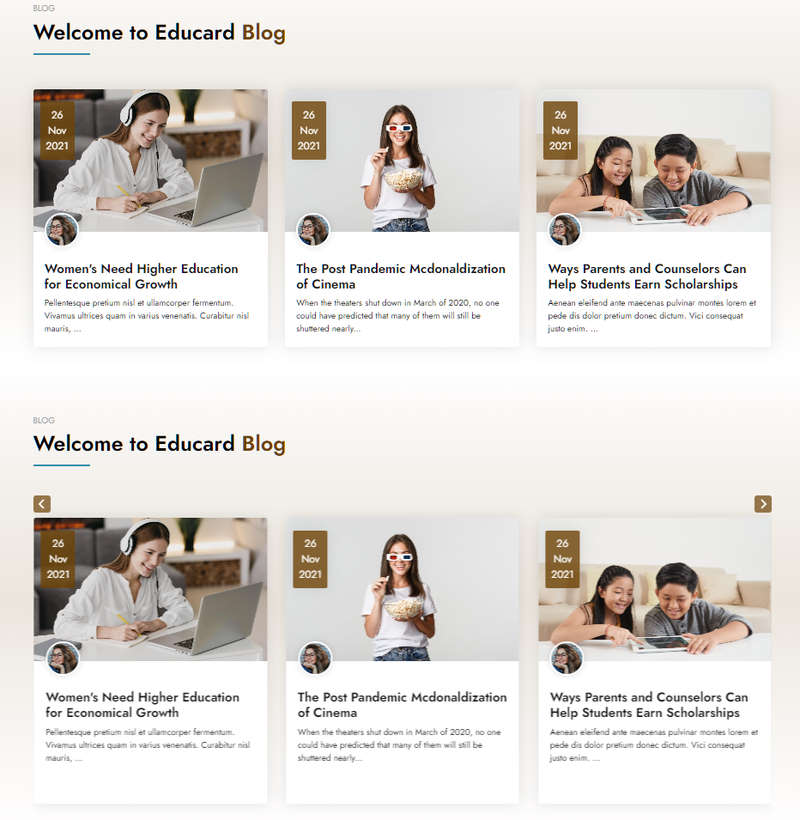
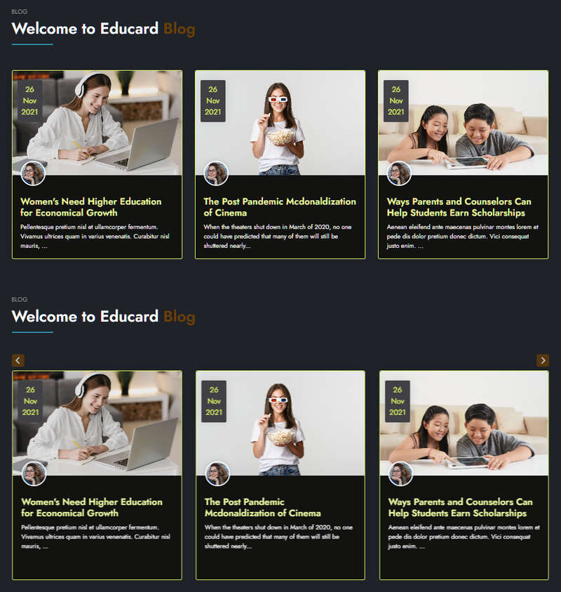
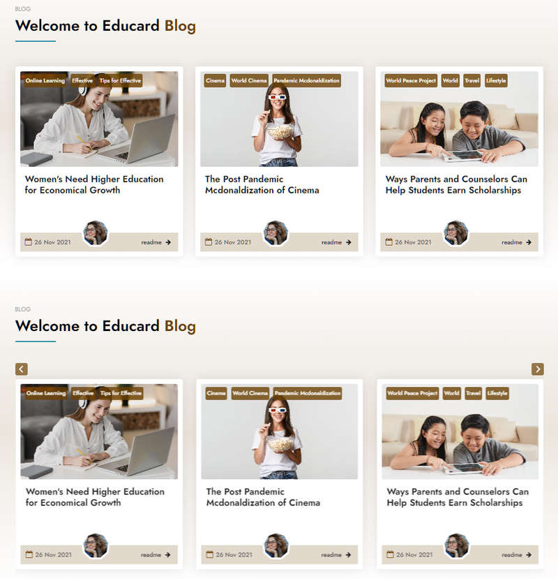
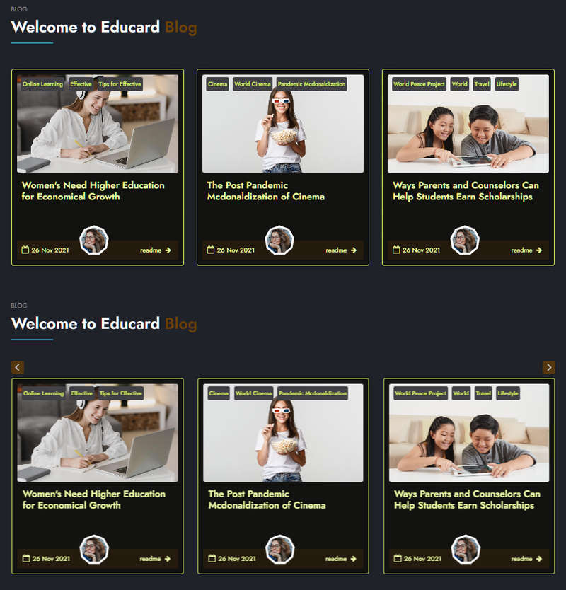
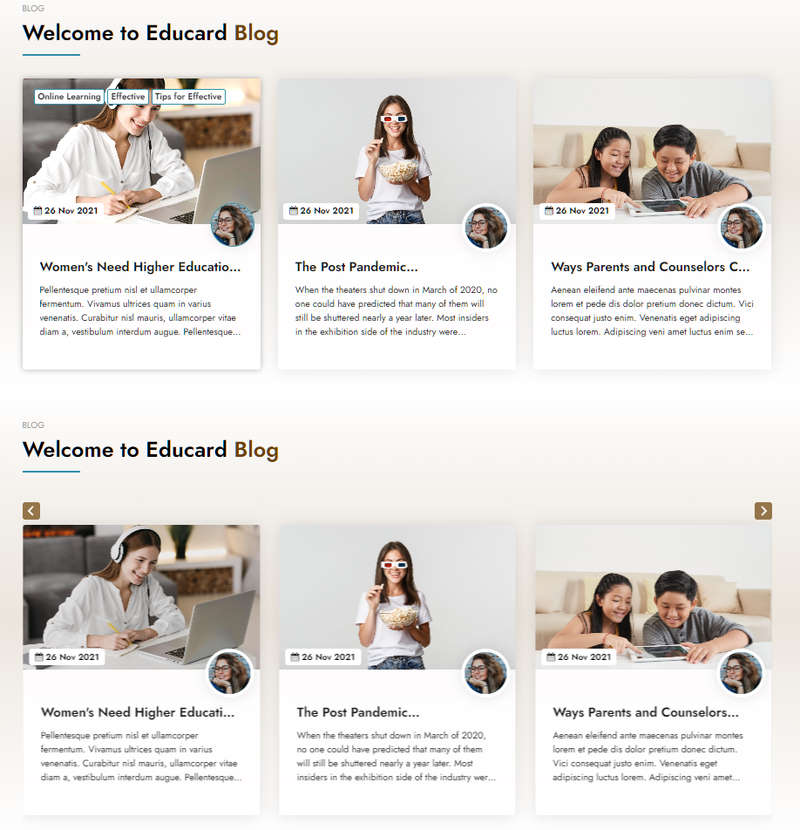
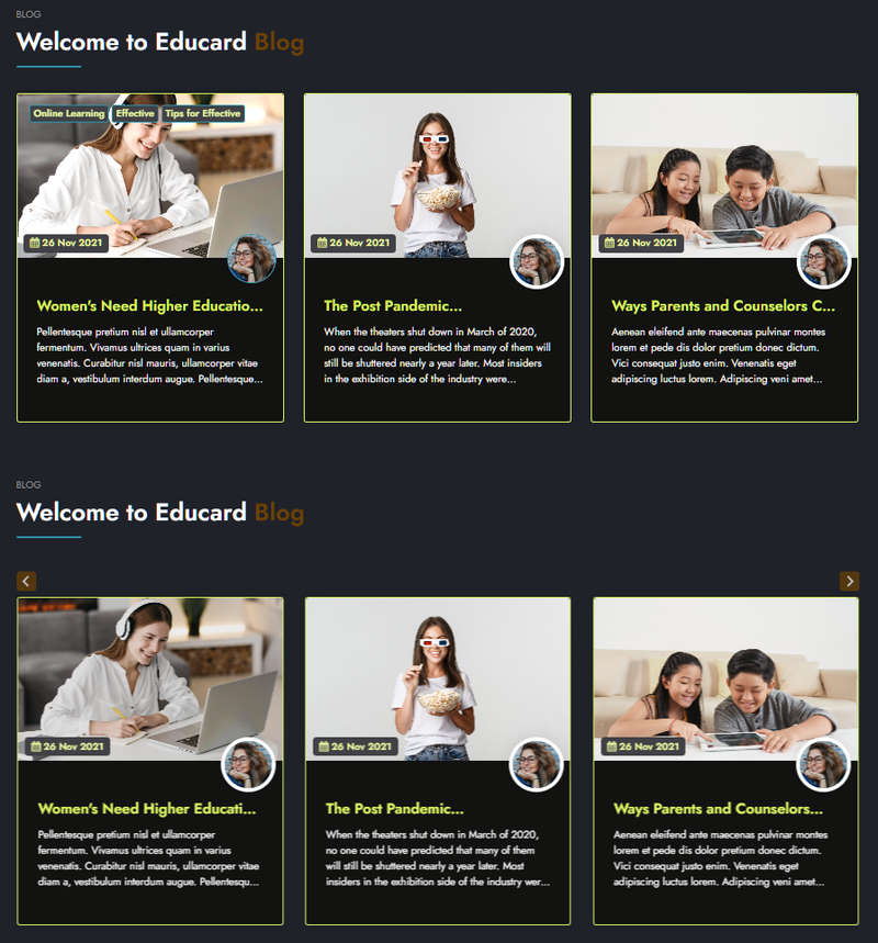
Educard Theme Block-11 BLOG POST tab desciription :
There are three designs for the blog post block. Displays blog posts on the front page. The Publish to option in the blog settings is valid.Enable block 11 : You can disable the block.
The disabled block is not displayed on the front page.
Block 11 headline : Headline text.
Block 11 header : Header text.
Block 11 main title : Main title text.
Block 11 background shapes : You can put shapes on the background.
Block 11 background gradient on-off : If it is defined, you can use a gradient in the background. The gradient is invalid in dark mode.
Block-11 Count : Select the number of blogs to be displayed on the front page, at least 2 and at most 10.
Save Changes Click for your changes to save.
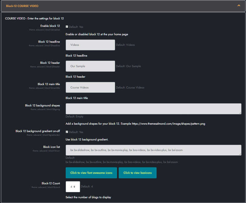
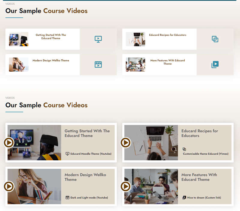
Educard Theme Block-12 COURSE VIDEO tab desciription :
Course video block consists of two designs.Enable block 12 : You can disable the block.
The disabled block is not displayed on the front page.
Block 12 headline : Headline text.
Block 12 header : Header text.
Block 12 main title : Main title text.
Block 12 background shapes : You can put shapes on the background.
Block 12 background gradient on-off : If it is defined, you can use a gradient in the background. The gradient is invalid in dark mode.
Block 9 Icon list : You can choose the symbols to use in the block. Enter the icon codes separated by commas. You can use Awesome Icons or Boxicons. (Örnek: bx bx-slideshow, bx bx-outline, bx bx-movie-play, bx bxs-videos, bx bx-video-plus, bx bxl-zoom)
Block-12 Count : Select the number of videos to be displayed on the front page, at least 2 and at most 6.
BLOCK CONTENT:
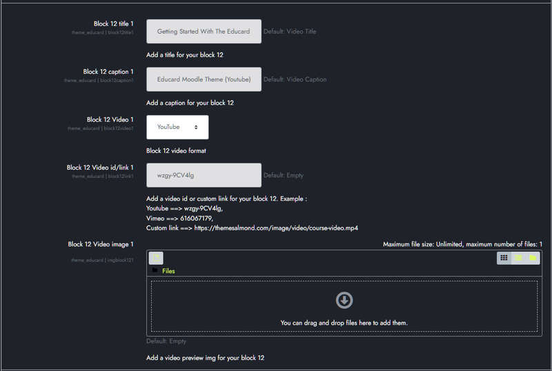
Block 12 title 1 : Video title.
Block caption 1 : Video caption.
Block 12 Video 1 : Video type. There are three options => Youtube, Vimeo, Custom Link.
Block 12 Video id/link 1: If the video type is Youtube or Vimeo, it is sufficient to enter the ID number of the video to be played. If Custom Link is selected, enter the URL of the video.
Example:
Youtube ==> wzgy-9CV4lg,
Vimeo ==> 616067179,
Custom link ==> 'https://themesalmond.com/image/video/course-video.mp4'
Block 12 Video image 1 : You can assign a picture here. If you leave it blank, if the image folder is not defined, randomly selected shapes are brought instead of the picture. If the image folder is defined, it takes the pictures from the addresses below;
For First Design ../image/block12/d1/1.jpg, 2.jpg, 3.jpg, 4.jpg, 5.jpg, 6.jpg
For Second Design ../image/block12/d2/1.jpg, 2.jpg, 3.jpg, 4.jpg, 5.jpg, 6.jpg
Fill in the other contents in the same way.
Save Changes Click for your changes to save.
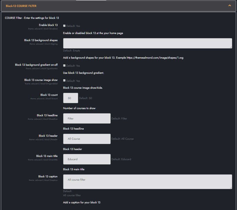
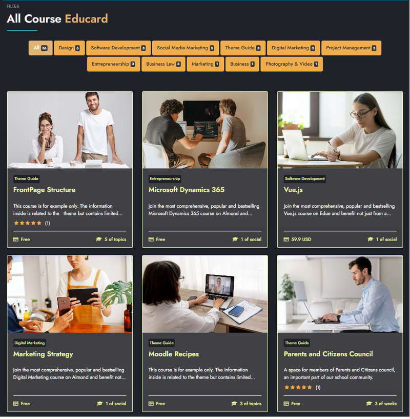
Educard Theme Block-13 COURSE Filter tab desciription :
Course filter block consists of one design. Filters the courses by category and brings them to the main screen.Enable block 13 : You can disable the block.
The disabled block is not displayed on the front page.
Block 13 background shapes : You can put shapes on the background.
Block 13 background gradient on-off : If it is defined, you can use a gradient in the background. The gradient is invalid in dark mode.
Block 13 course image show : Enable it for Course images to appear.
Block 13 count : Number of courses to show.
Block 13 headline : Headline text.
Block 13 header : Header text.
Block 13 main title : Main title text.
Block 13 caption : Caption text.
Save Changes Click for your changes to save.

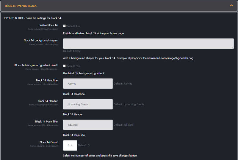
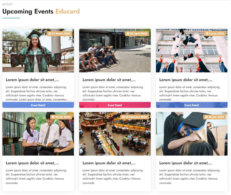
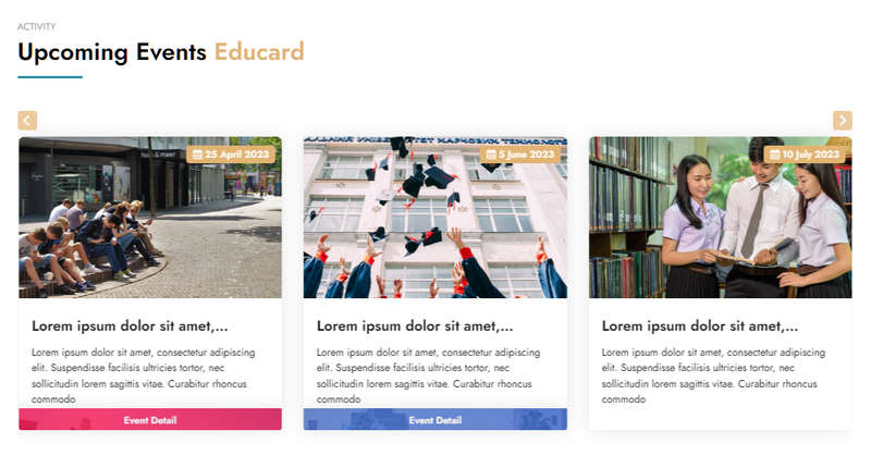
Educard Theme Block-14 EVENTS BLOCK tab desciription :
Events block consists of one design. Displays the created events on the main page.Enable block 14 : You can disable the block.
The disabled block is not displayed on the front page.
Block 14 background shapes : You can put shapes on the background.
Block 14 background gradient on-off : If it is defined, you can use a gradient in the background. The gradient is invalid in dark mode.
Block 14 headline : Headline text.
Block 14 header : Header text.
Block 14 main title : Main title text.
Block 14 count : Number of events to show from 2 to 8.
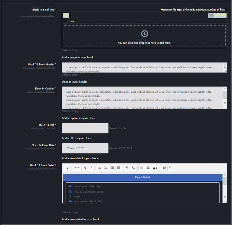
BLOCK CONTENT:
Block 14 Block img 1 : You can assign a picture here. If you leave it blank, if the image folder is not defined, randomly selected shapes are brought instead of the picture. If the image folder is defined, it takes the pictures from the addresses below;
For First Design ../image/block14/d1/1.jpg, 2.jpg, 3.jpg, 4.jpg, 5.jpg, 6.jpg, 7.jpg, 8.jpg
Block 14 Event Header 1 : Event header text.
Block 14 Caption 1 : Event caption text.
Block 14 URL 1 : The address of the link that the title will go to when clicked.
Block 14 Event Date 1 : Event date.
Block 14 Event Detail 1 : Information about the details You can design it as you want using HTML.
Fill in the other contents in the same way.
Save Changes Click for your changes to save.
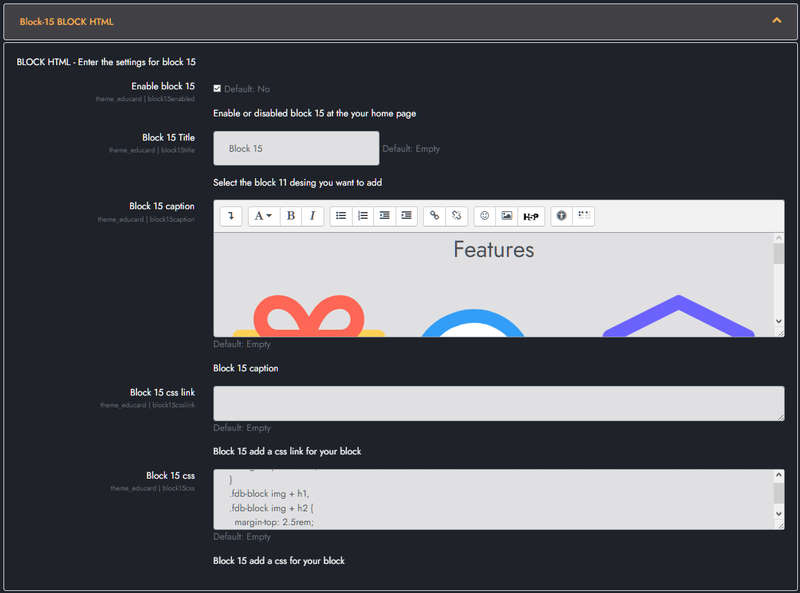
Educard Theme Block-15-16-17-18 HTML BLOCK tab desciription :
Here you can create your own blocks with HTML codes.Enable block 15 : You can disable the block.
The disabled block is not displayed on the front page.
Block 15 Title : Title text.
Block 15 caption : Write or copy the HTML codes here.
Block 15 css link :If you want to use css registered in another domain, enter the css link URL here. (Örnek: "https://www.w3schools.com/w3css/4/w3.css")
Block 15 css : You can write your css codes directly here.
You can also use Block-16 BLOCK HTML, Block-17 BLOCK HTML, Block-18 BLOCK HTML in any position of the main page.
Save Changes Click for your changes to save.
Example Html and css codes;
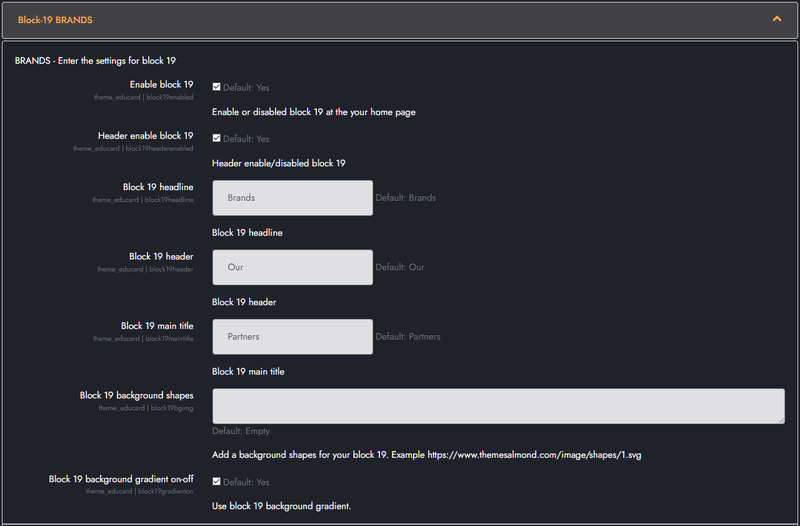
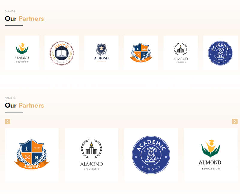
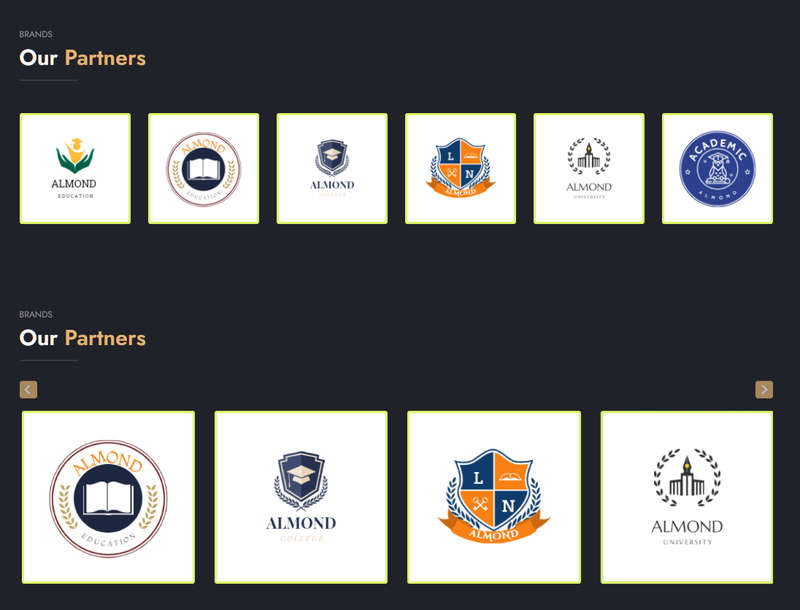
Educard Theme Block-19 BRANDS tab desciription :
Brands block consists of two designs. The brand image displays the six companies uploaded on the homepage. It can be viewed as a slide in both designs.Enable block 19 : You can disable the block.
The disabled block is not displayed on the front page.
Header enable block 19 : Block header enabled/disabled.
Block 19 headline : Headline text.
Block 19 header : Header text.
Block 19 main title : Main title text.
Block 19 background shapes : You can put shapes on the background.
Block 19 background gradient on-off : If it is defined, you can use a gradient in the background. The gradient is invalid in dark mode.
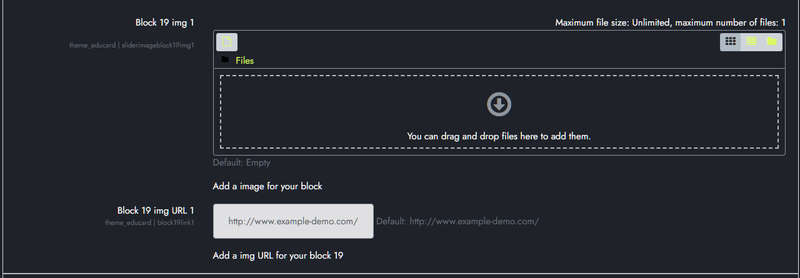
BLOCK CONTENT:
Block 19 img 1 : You can assign a picture here. If you leave it blank, if the image folder is not defined, randomly selected shapes are brought instead of the picture. If the image folder is defined, it takes the pictures from the addresses below;
For First Design ../image/block19/d1/1.jpg, 2.jpg, 3.jpg, 4.jpg, 5.jpg, 6.jpg For Second Design ../image/block19/d2/1.jpg, 2.jpg, 3.jpg, 4.jpg, 5.jpg, 6.jpg
Block 19 img URL 1 : The link of the image.
Fill in the other five fields in the same way.
Save Changes Click for your changes to save.
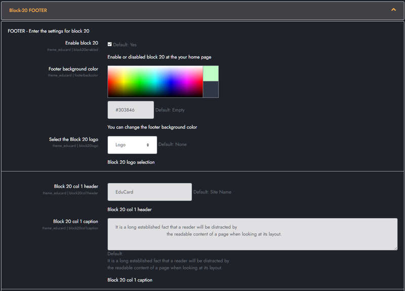
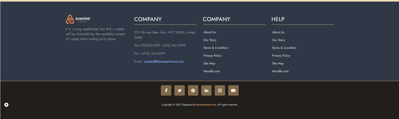
Educard Theme Block-20 FOOTER tab desciription :
The footer block consists of one design. There are four columns, social media buttons, and a copyright section. You can customize it according to the features of your site.Enable block 20 : You can disable the block.
The disabled block is not displayed on the front page.
Footer background color : You can choose the background color for the footer. Its original color is class=bg-dark (#201f1e).
Select the Block 20 logo : You can choose one of the installed logos from Site administration > Appearance > Logos. If you choose None, it will only show the site name. It allows you to select a logo that matches the background color.
COLUMN 1 :
Block 20 col 1 header : The site name that will be displayed when you select 'None'.
Block 20 col 1 caption : Column 1 description below the logo.
COLUMN 2 :
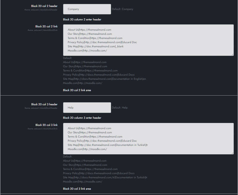
Block 20 col 2 header : Column 2 header.
Block 20 col 2 link :Link description. Take the default as an example when entering links. You can use target in links, if you leave it blank, the default is "_self". (Exp: "About|https://themesalmond.com|_blank" )
COLUMN 3 :
Block 20 col 3 header : Column 3 header.
Block 20 col 3 link :Link description. Take the default as an example when entering links. You can use target in links, if you leave it blank, the default is "_self". (Exp: "About|https://themesalmond.com|_blank" )
COLUMN 4 :
Block 20 col 4 header : Column 4 header.
Block 20 col 4 caption : AIt is the section used for the address and can be used for different purposes optionally.
Exp.: 379 5th Ave New York, NYC 10018, United States
Tel:+112345 6999 +(112) 345 6999
Fax: +(112) 345 8999
Email: contact@themesalmond.com
Block 20 social links :You can add social media links here. You can change icons with box icon. Substitute the link url for the "#" character.
Default :
            <ul class="social-network social-circle bg-white">
                <li>
                    <a href="#" class="icoFacebook" title="Facebook">
                        <i class="fa fa-facebook"></i>
                    </a>
                </li>
                <li>
                    <a href="#" class="icoTwitter" title="Twitter">
                        <i class="fa fa-twitter"></i>
                    </a>
                </li>
                <li>
                    <a href="#" class="icoPinterest" title="Pinterest">
                        <i class="fa fa-pinterest"></i>
                    </a>
                </li>
                <li>
                    <a href="#" class="icoLinkedin" title="Linkedin">
                        <i class="fa fa-linkedin"></i>
                    </a>
                </li>
                <li>
                    <a href="#" class="icoInstagram" title="Instagram">
                        <i class="fa fa-instagram"></i>
                    </a>
                </li>
                <li>
                    <a href="#" class="icoYouTube" title="YouTube">
                        <i class="fa fa-youtube-play"></i>
                    </a>
                </li>
            </ul>
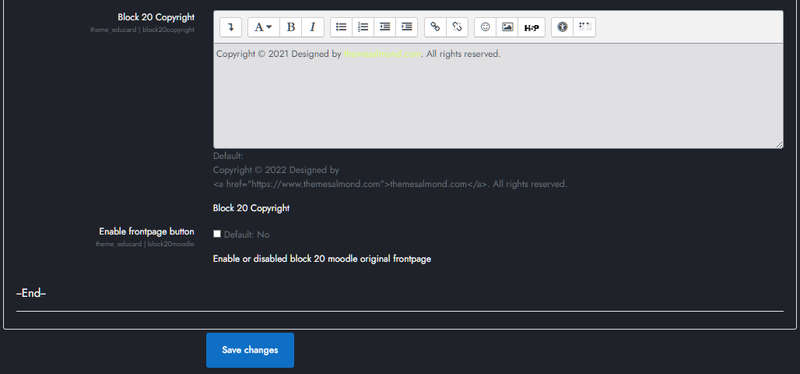
Block 20 Copyright : You can edit the copyright field as you wish.
Enable frontpage button : If you enable it, you will see the icon in the footer. If you click on the icon, Moodle will display the original frontpage page inside the modal window.
Save Changes Click for your changes to save.
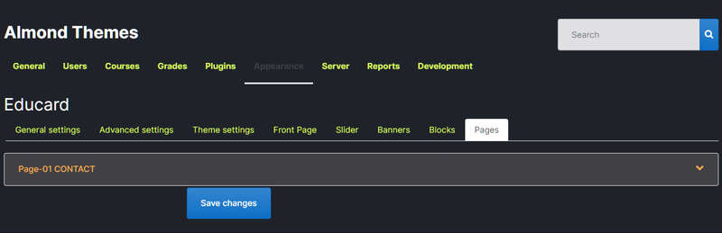
Educard Theme Pages tab desciription :
Dynamic pages to display on the front page of the Educard theme. There are different designs of sheets. You can create hundreds of unique homepages with the combinations you will make. Different designs will continue to be added in theme updates. Page content settings are made here. The default contents are created automatically when the theme is installed, so you can easily change it.Save Changes Click for your changes to save.
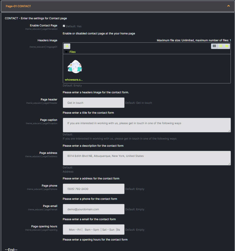
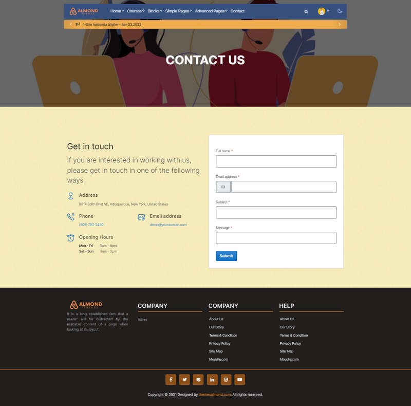
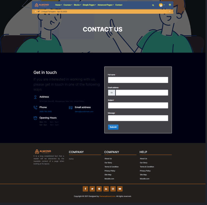
Educard Theme Page-01 CONTACT tab desciription :
The page that will allow your customers to contact you easily. Uses MOODLE settings for email.(Site administration/Server/Email/Outgoing mail configuration)
Enable Contact Page : You can disable the page.
The disabled page is not displayed on the front page.
Headers image : Upload picture. If you leave this field blank, if the image folder path is specified, it will automatically take the pictures from the addresses below;
For First Design ../image/page01/d1/1.jpg
With this method, you can define separate images for each design, you don't have to upload new images when you change the design.
Page header : Header text.
Page caption : Enter description.
Page address : Your contact address information.
Page phone : Phone number to contact you.
Page email : Email to contact you.
Page opening hours : Opening and closing hours of your company.
check the example before logging in, '|' Pay attention to the sign.
Save Changes Click for your changes to save.